How to Use a Tonal Grid Fabric as a Quiet Background in Fall Quilts
Every strong fall quilt needs somewhere for the eye to rest. Pumpkins, leaves, acorns, and rich autumn prints do the storytelling, but they show up best against a fabric that is interesting without being loud. The Awe of Autumn Grid Creamsicle from Riley Blake Designs fills that role beautifully: a soft, warm-toned cotton with a subtle tonal grid that reads as texture first and pattern second.
What This Fabric Is
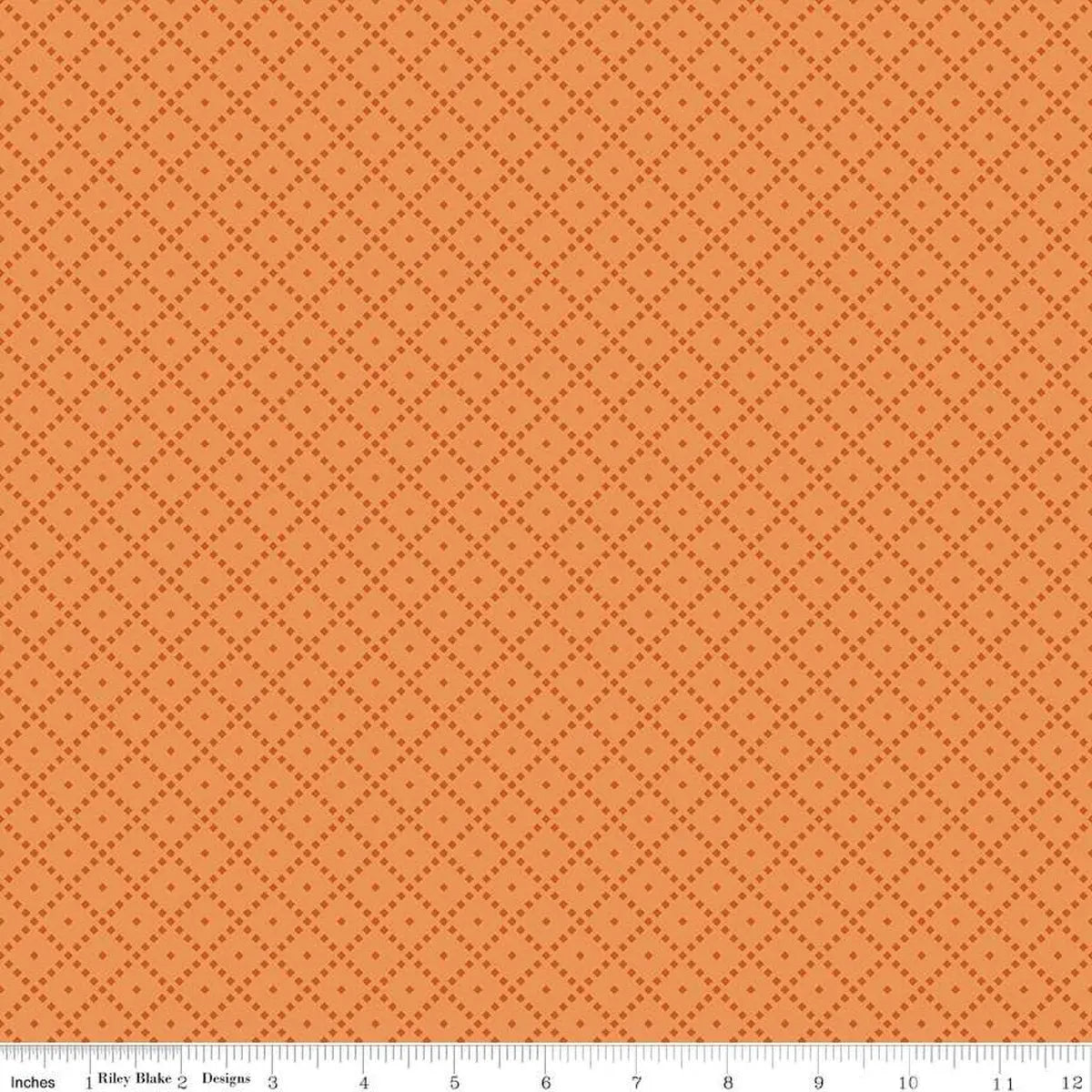
This is a 100 percent cotton quilting fabric, 43/44 inches wide and sold by the yard. It comes from The Awe of Autumn collection designed by Sandy Gervais for Riley Blake Designs. The colorway is Creamsicle — a warm, creamy orange tone — and the print features a tonal grid design, meaning the grid lines are rendered in closely related shades rather than in high contrast.
Riley Blake Designs describes The Awe of Autumn as suitable for quilting, apparel, and home decor, and this grid print is one of the hardest-working pieces in that mix. It is not a feature print. It is a blender and background fabric, the kind you reach for again and again within a single project and across a whole season of fall sewing.
Why a Grid Works as a Background
A plain solid can look flat next to detailed fall prints, and it shows every wrinkle and stray thread. A tonal grid solves both problems. Up close, the regular lines add a tailored, almost woven structure that gives plain areas of a block more presence. From a few steps back, the grid softens into gentle texture, so leaf appliqué, star points, and feature blocks stay in the spotlight.
The grid also gives you a quiet sense of order. In a sampler quilt, using the same grid background across different blocks unifies blocks that might otherwise feel disconnected. In a simple patchwork, it adds just enough geometry to keep large expanses from feeling empty.
Cutting and Piecing Tips
Because the grid is tonal and low-contrast, you do not need to fussy-cut it or match the lines at every seam — the design is forgiving. Still, a few habits help. Cut background pieces on the straight of grain and keep your cutting direction consistent if you want the grid to run the same way across a block. For sashing and borders, cut long strips lengthwise where possible so the lines run uninterrupted.
When piecing, press seams toward the darker feature fabrics where you can. That keeps seam allowances from shadowing through the lighter Creamsicle ground. A consistent quarter-inch seam matters more here than print matching: crisp, accurate piecing lets the grid sit quietly behind your points and corners.
Pairing Colors and Project Ideas
Creamsicle is a natural partner for the deeper colors of autumn. Pair it with rust, chocolate brown, olive, gold, and deep teal for contrast, or keep it in a softer palette with sage, tan, and cream for a lighter, farmhouse feel. Within a collection like The Awe of Autumn, use the grid anywhere you would normally reach for a solid background: block backgrounds, sashing, inner borders, and setting squares.
Beyond quilt tops, this fabric works well for table runners and placemats where fall feature prints need a calm frame, pillow shams, and seasonal apparel accents. It also makes an excellent backing for smaller quilts where a soft, warm reverse side is part of the charm.
Care
Care is simple: machine wash cold and tumble dry low, following the guidance for this fabric. As with any quilting cotton, washing gently in cold water helps preserve both the warm Creamsicle color and the crisp hand of the fabric through many seasons of use.
If your fall projects feel busy, start here. One good tonal grid can quiet the whole quilt — and make everything you pair with it look better.
Shop the The Awe of Autumn Grid Creamsicle 43"/44" Fabric Per Yard at Linda's Electric Quilters.