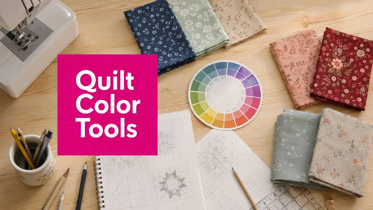
Staring at a fabric stash and wondering why some quilts feel balanced while others look busy before the first seam is even sewn? That's the gap in quilt color schemes. The right palette is only part of the job, because value, contrast, thread, and quilting all change how the finished top reads. Our team in McKinney, Texas, leans on a mix of digital planners and hands-on studio tools to move from inspiration photo to cut-ready quilt top with less guessing and more confidence. For a quick inspiration jump, explore the patchwork tile range alongside your fabric pull.
1. Electric Quilt 8 for serious quilt color planning
Electric Quilt 8 is the heavyweight choice when the quilt color scheme needs to be tested before a single cut lands on the mat. It's a desktop program for Mac and Windows, and that matters because it gives you deep control over block layout, borders, rotation, and whole-quilt colorway changes without fighting a browser tab. The built-in library is large, the recolor tools are fast, and the yardage and cutting charts help turn a pretty concept into something you can kit.

Why it works in real shop planning
EQ8 is strongest when a design depends on secondary patterns, border decisions, or block repeats that need visual consistency. If you're previewing a high-contrast top for longarm work, the ability to swap fabrics across the entire quilt or only one block is a real advantage. The tool also fits the historical reality of quilt color schemes, because you can compare muted palettes, bright palettes, and high-value-contrast layouts side by side before you commit.
Practical rule: if a quilt relies on repeated blocks, test the top in both a busy print mix and a quieter solid mix before you cut.
A few things make EQ8 feel professional instead of playful. First, the one-time license suits serious makers who don't want a subscription tied to a project timeline. Second, the learning curve is real, but that depth is exactly why longarmers and designers keep returning to it. Third, if you want color choices to hold up after quilting, EQ8 gives you enough layout control to see where a light thread, dark thread, or dense quilting motif will change the reading of the design.
For makers who also want the business side of quilting to stay organized, the software pairs well with a planned workflow and a clean studio system. One example of that kind of organizational ecosystem is this gifted collaboration application, which fits naturally into a designer's broader production stack.
2. PreQuilt for fast palette testing on any device
PreQuilt is the tool to reach for when the question is less “Can I design this?” and more “Will this colorway sing?” Because it runs in a browser, it moves easily from laptop to tablet without changing the workflow. That makes it useful for quick palette iteration, customer mockups, and those moments when you want to audition a quilt color scheme during a shop visit or from the cutting table.

Where PreQuilt saves time
The built-in solid cards from lines like Kona, Pure Solids, Confetti Cottons, and Designer Essentials help you stay grounded in real fabric families instead of generic digital swatches. The Color Randomizer and other “Magic” tools are especially good for breaking decision fatigue, then backing up to a more controlled scheme once you spot a direction you like. That's useful when you're trying to build a palette from one print or a pre-cut bundle without letting the final quilt drift into mud.
PreQuilt also has a fabric calculator for yardage, backing, and binding, which turns it into more than a palette toy. If you're planning for a customer, the coloring-page publishing feature helps them see the quilt in their own hands before you cut. That can be the difference between a hesitant buyer and a confident one.
A useful trade-off is that the subscription provides the full experience, so it's best for makers who plan to use it repeatedly. It's not the deepest design environment, but it is one of the quickest ways to test cool palettes, compare contrast, and see whether a scheme stays crisp once it's translated into an actual quilt top.
3. QuiltInk for testing real patterns with real fabrics
QuiltInk is built for the point where a quilt color scheme needs to stop being theoretical and start living on a pattern. Instead of staring at a blank block grid, you recolor supported designer patterns directly. That makes the decision feel more concrete, especially when you're trying to judge whether a palette reads as bold, calm, or crowded once it's placed into an actual block structure.
Why shops and modern makers like it
The community angle matters here. Seeing what other quilters have done with the same pattern can cut down on second-guessing, and the shared palette feed can spark combinations you wouldn't build from scratch. Shops and designers can also host fabrics and create kits, which turns the platform into a practical sales and planning tool, not just a pretty preview space.
One natural use case is the maker who wants a controlled colorway but still likes the energy of print-heavy fabrics. The platform helps you test whether the print mix supports the pattern or starts fighting it. That's a big deal, because many quilt color schemes look fine in isolated swatches and then lose clarity once the pattern adds seams, angles, and repeated value changes.
A catalog item like #Charms11 fits this kind of decision-making because its hand-dyed wool and vivid color range are the sort of materials quilters often audition into mixed-media projects or accent planning. It's not about forcing wool into every quilt. It's about recognizing how a strong color piece can anchor a broader palette.
For shop owners, QuiltInk's biggest strength is speed. It's faster than building every idea from scratch, and that speed helps when you're turning one favorite pattern into several sellable color stories.
4. Quiltster for kit planning and foundation pattern work
Quiltster works especially well for makers and shops that build around foundation patterns and kit-based projects. You can drop real fabrics into supported patterns, then preview how the layers read before anything gets cut. That matters in quilt color schemes because a palette can look balanced in a flat swatch and still turn muddy once seams, points, and repeated units start stacking up. For longarmers, that preview also helps with dense areas, contrast zones, and directional changes that affect the finished surface.
Best use cases in a working studio
Kitting is where Quiltster earns its place in the studio. If you are building a customer project or planning a pattern with several fabric roles, the planner gives you a cleaner way to test placement before expensive yardage is sliced. It helps you catch the common problem where the lightest fabric gets overused or the darkest fabric disappears into the layout.
The platform fits shop and designer workflows too, which keeps it useful beyond solo sewing. A designer can show placement intent without a long explanation, and a retailer can reduce confusion during ordering and kit assembly. For sellers who also support maker communities and creator outreach, a platform like this influencer gifting platform fits naturally into the same ecosystem of project promotion and kit planning. That makes Quiltster practical for anyone who sells kits or teaches patterns that depend on strict color placement.
A pattern can look balanced in a sketch and still fail in fabric if the value jumps are too soft.
That becomes clear as soon as you audition a quilt color scheme in a real layout. Quiltster does not replace a trained eye, but it gives that eye a better place to work. If you are comparing several versions of the same quilt, the subscription cost can be easier to justify than the waste from a cut list that misses the mark. It also helps once you are ready to move from inspiration photo to cut-ready quilt top, because the placement decisions are already closer to reality before fabric hits the table.
5. Adobe Color for turning inspiration photos into palettes
Adobe Color is the cleanest free option when a quilt idea starts with a photograph instead of a fabric line. Upload the image, extract the palette, and then use the harmony rules to push the scheme toward analogous, triad, or other classic structures. That makes it useful for quilters who are building from a home interior, a flower photo, a vintage print, or even a single fabric pull shot on a table.

What makes it different from quilt-specific apps
Adobe Color doesn't know quilting, and that's the trade-off. It won't tell you how much yardage to buy, and it won't choose fabric lines for you. What it does well is give you a disciplined starting point, especially when you need to separate a muddy inspiration image into usable color families.
That matters in quilt color schemes because value often matters more than hue alone. A palette extracted from a photograph can look beautiful but still fail as a quilt if the colors sit too close together. Adobe Color helps you notice that before the fabrics are purchased.
Studio habit: when a palette looks flat on screen, print it or compare it against physical fabric under daylight before you trust it.
The app also exports HEX and RGB values, which is handy if you're matching thread in a digital mockup or keeping the palette consistent across a design file. That makes it a good bridge tool, not the final answer. For quilters who want the fastest route from a photo to a refined idea, it's one of the easiest places to start.
If you're also building influencer content around a palette reveal or kit launch, this influencer outreach service can sit alongside the same visual workflow without dragging the design process down.
6. Canva Color Palette Generator for quick first-pass ideas
Canva Color Palette Generator is the simplest tool on this list, and that's exactly why it earns a place in a practical quilt workflow. Upload a photo, get a small palette back, and use the HEX codes as a starting point. For beginners, that kind of speed removes friction. For experienced quilters, it's useful when the goal is to get a rough direction before refining the scheme in a more quilting-specific app.

Where it shines and where it stops
Canva's strength is frictionless concepting. There's no learning curve to speak of, and the palette output is easy to copy into other tools. That makes it a strong first stop when you have a floral photo, a room scene, or a favorite print and want to see the dominant colors without getting buried in settings.
The limit is obvious. It doesn't understand fabric families, contrast, or yardage, so it can't finish the quilt planning job. It also won't help much if you need a palette that holds together under quilting stitches, because it only gives you the color bones, not the construction.
Still, that's useful. A fast tool like this can reveal whether your original photo leans warm, cool, or neutral before you commit to a more structured design path. For makers who think visually but don't want to spend half an hour opening a full design program, it's a low-pressure way to begin.
If your work leans into creator education or community content, this UGC creator platform can be useful for turning a palette into a shareable project story without changing your quilting process.
7. Ultimate 3-in-1 Color Tool for real-lighting fabric checks
Ultimate 3-in-1 Color Tool is the hands-on studio tool that keeps screen color from fooling you. It is built for judging hue and value in real lighting, which is where a quilt color scheme either holds together or falls apart. For shop visits, retreats, classes, and longarm prep, that physical check is hard to beat.
Why tactile tools still matter
Digital tools are fast, but they cannot tell you how a fabric behaves under the lights in your studio. This color tool helps with that by giving you value finders and scheme suggestions right in your hands. That is especially useful when you are comparing solids, blenders, and thread against the top, because value contrast can make or break legibility after quilting.
The compact format is another advantage. It is easy to carry to a fabric shop or class, so you can make a decision in the moment instead of guessing later. It also works well for teaching because the visual proof is immediate. A student can see why two fabrics that look similar online behave very differently under a natural light source.
This tool also fits the dominant, subordinate, accent model well. That framework depends more on value than on sheer color variety, and a physical card system makes the lesson easier to read. It does not replace software, but it pairs well with software when you are trying to keep a quilt readable after binding, quilting, and thread choices are added.
In our McKinney, TX studio, we treat it as part of a larger workflow, not a stand-alone novelty. A project might start with an inspiration photo, move through digital palette testing, and then come back to this tool for a real-lighting check before anything is cut. That same process shows up in our UGC creator course work, where clear visual decisions matter just as much as the finished output.
For a color-forward pre-cut or accent addition, #Charms11 Neon is another in-stock option worth keeping in the back of your mind when you want a bright, hand-dyed look in a project lineup.
7-Tool Quilt Color Scheme Comparison
| Tool | 🔄 Complexity | ⚡ Resources & Cost | 📊⭐ Expected Outcomes | 💡 Ideal Use Cases | ⭐ Key Advantages |
|---|---|---|---|---|---|
| Electric Quilt 8 (EQ8) | High, feature-rich desktop app; noticeable learning curve | High upfront one‑time license; Mac/Windows desktop; local storage | Professional, precise quilt designs with yardage/templates; ⭐⭐⭐⭐ | Professional designers, longarmers, detailed kitting and production | Extensive fabric/block libraries; powerful layout, recolor and yardage tools |
| PreQuilt | Moderate, intuitive web tools with some advanced features to learn | Subscription for full features; browser-based (any device) | Fast palette exploration and shareable mockups; ⭐⭐⭐⭐ | Rapid colorway iteration, customer coloring pages, retail consultations | Device-agnostic color cards, playful randomizer/Magic tools for quick ideas |
| QuiltInk | Low–Moderate, straightforward recolor workflow; community features | Free for end users; shops/designers may pay; web-based | Real-pattern recoloring and community palettes; ⭐⭐⭐ | Shops offering kits, makers auditioning patterns, community inspiration | Pattern-specific auditioning, public/private palettes, kit hosting for shops |
| Quiltster | Moderate, planner-focused web app with onboarding | Subscription required for Quilt Planner features; shop integrations | Accurate fabric placement and yardage preview for kits; ⭐⭐⭐⭐ | Kit-building shops, complex foundation-pattern users, longarm contrast planning | Purpose-built kitting/yardage tools and marketplace/designer workflows |
| Adobe Color | Low, simple web interface with color-theory tools | Free (Adobe ID optional); browser-based | Professional HEX/RGB palettes from images; accessibility checks; ⭐⭐⭐ | Extracting palettes from photos, thread color matching, initial digital mockups | Powerful harmony rules, image-to-palette workflow, exportable color codes |
| Canva Color Palette Generator | Very low, one-click palette extraction | Free; no login required for basic use; web/mobile | Quick 4–5 color starters with HEX codes; ⭐⭐ | Beginners, fast concepting, mood-board starts before refinement | Extremely fast and simple; integrates with Canva designs |
| Ultimate 3‑in‑1 Color Tool (Joen Wolfrom) | Low, physical tool, direct hands-on use | Paid physical product; no digital requirements | Reliable in-person value/contrast assessment under real lighting; ⭐⭐⭐⭐ | In-person fabric auditioning, classes, guild demos, longarm value checks | Real-light evaluation, value finders, durable teaching/demo tool |
Bringing Your Perfect Palette to Life
The best quilt color schemes start with a clear question, then move through the right tools in the right order. A photo extractor like Adobe Color or Canva can give you the first read. EQ8, PreQuilt, QuiltInk, and Quiltster can then test whether that idea still works once it becomes a real quilt layout with fabric placement, contrast zones, and yardage decisions. The physical color tool closes the loop by checking the final look under studio lighting, which is where too many digital palettes break down.
That historical perspective matters too. Quilt color schemes have always reflected the technology of the moment. The shift from plant and animal dyes to synthetic dyes in the 19th century opened up richer palettes, and later trends like Turkey red, double blue, cheddar orange, and brighter aniline-era colors show how strongly fabric availability shapes style. Those changes are part of why palette choice can help estimate age, regional style, and the maker's available materials.
Our own studio approach in McKinney usually starts with value, then hue, then thread. A quilt can look balanced in a mockup and still feel off once quilting is added, so we check contrast early and use tools that make the finished surface easier to read. That's also why the classic palette structures, monochromatic, analogous, complementary, and triadic, stay useful. They give you a reliable framework when you're trying to move from inspiration to cut line with confidence.
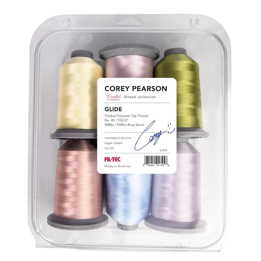
If you're shopping for the materials that will finish the job, Linda's Electric Quilters has the fabrics, batting, threads, and notions that support this kind of planning. Pair a tested palette with the right supplies, and your quilt has a much better chance of looking intentional from the first block to the last binding stitch.
Linda's Electric Quilters gives quilters the products and education to turn a color plan into a finished project, from fabric and batting to thread and notions. Visit Linda's Electric Quilters to shop the supplies that fit your next quilt color scheme and keep your build moving.