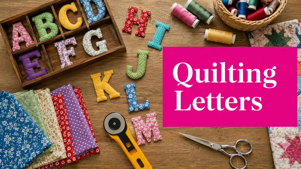
Adding quilting alphabet letters usually starts with a very normal problem. You have the quilt top planned, the colors are right, the piecing looks good, and then you realize the project needs a name, a date, an initial, or a word that gives it meaning. That's where many quilts either become memorable or start looking awkward.
The method matters. Appliqué handles curves and script well. Piecing and foundation paper piecing give you a crisp, graphic look. Machine embroidery and longarm lettering deliver consistency and decorative detail when the setup is right. The cleanest result comes from matching the lettering method to the fabric, scale, and finish you want, instead of forcing one technique onto every quilt.
Personalizing Your Quilt with Alphabet Letters
A quilt with lettering feels different the moment you see it. A baby quilt with a name, a wedding quilt with initials, or a wall hanging with a single word has more presence than a quilt made from blocks alone. Quilting alphabet letters turn fabric into a message, and that changes how the whole piece is read.

This isn't a modern novelty. The Smithsonian dates Elva Smith's Alphabet Quilt Top to 1896, and notes that it includes 30 separate 8-inch square white blocks in a formalized alphabet layout used for decoration and educational display, which you can see in the Smithsonian object record for the 1896 alphabet quilt top. That history matters because it reminds us that letters in quilts have long been both visual and practical.
What works in the shop is simple. Start by deciding what the letters need to do.
- If the letters are the focal point, use a method that gives clean edges and strong contrast.
- If the letters support the quilt design, keep them quieter in scale and fabric value.
- If the quilt will be handled often, choose a construction method that can stand up to washing and use.
- If the project is more decorative than utilitarian, you can lean into fine detail and delicate stitching.
Practical rule: The more expressive the font, the simpler the fabric around it needs to be.
In McKinney, we see quilters get the best results when they make the lettering decision early, not after the top is already crowded. That one choice affects block size, seam placement, thread visibility, batting loft, and even binding color. Letters are design elements, not an afterthought.
Planning Your Layout and Choosing a Font
Before fabric is cut, decide whether the eye should read the word instantly or discover it as part of the quilt. That one choice guides almost every planning decision. Strong readability calls for open shapes, clean spacing, and steady contrast. A more integrated look lets the letters blend into the patchwork, but it still needs structure.

Choose the font by construction method
Not every font belongs in every technique. That's where many lettering projects go off track.
- Block and sans-serif fonts are usually the easiest for piecing. Their straight segments translate well into squares, rectangles, and sharp seam intersections.
- Rounded print fonts suit raw-edge appliqué because the curves don't have to be broken into hard geometric units.
- Script fonts nearly always behave better in appliqué or embroidery than in piecing. Tight turns and thin connections are difficult to keep legible with seam allowances.
- Highly decorative fonts can work, but only if the letter scale is large enough to preserve counters, stems, and interior openings.
If you're pulling fabrics first, it helps to lay out lettering options alongside precut fabrics so you can judge contrast and repeat scale before you commit.
Size and spacing decide whether the quilt reads clearly
Crowding is one of the biggest problems with quilting alphabet letters. Letters need breathing room around them, not just inside them. The background fabric acts like negative space in typography. If that space gets too tight, the letters lose their shape even when your stitching is accurate.
A solid planning approach looks like this:
- Print or trace the letters at full size.
- Place them on the intended block or quilt area.
- Check the narrowest parts first. Inner corners, center cutouts, and curved joins usually fail before the outer edges do.
- Add seam allowance thinking. A letter that looks fine on paper may feel cramped once seams, quilting, and binding come into play.
If you can't recognize the word from across the room before sewing, it won't get clearer after quilting.
Match placement to the quilt's purpose
A baby name centered on a quilt top behaves differently than a full alphabet sampler. So does a single monogram on a pillow compared with a phrase on a wall hanging.
Here's the planning trade-off I recommend most often:
| Layout choice | Best use | Watch for |
|---|---|---|
| Centered word or name | Baby quilts, gift quilts, pillows | Uneven spacing becomes obvious |
| One letter per block | Samplers, educational quilts, playful layouts | Fabric inconsistency can make letters feel disconnected |
| Scattered letters | Modern quilts, novelty quilts | Can start looking random without a visual grid |
For drafting, paper still wins for many quilters because you can see proportion quickly. Digital design tools help with repetition and alignment, but the final test is still fabric on a design wall.
A short trial block saves frustration. It also tells you whether your chosen font belongs in piecing, appliqué, or embroidery before you cut the whole project.
Mastering Appliqué for Any Letter Shape
A customer brings in a quilt top with a grandchild's name picked in a pretty script font. On paper, it looks perfect. In fabric, the loops are narrow, the joins are tight, and the letter edges will decide whether that name reads cleanly or turns fuzzy after quilting. That is why appliqué is often the right choice for lettering. It handles shapes that piecing fights against, especially curves, diagonals, and handwritten styles.
Appliqué also asks you to make one clear decision up front. Choose the edge finish before you choose the fabric and thread, because that choice affects durability, stitch visibility, drape, and how much detail the letters can hold.
Raw-edge appliqué versus turned-edge appliqué
Raw-edge appliqué gives the most control on alphabet work with fine detail. Fuse the letter in place, stitch it down, and keep the original shape of the font with very little distortion. It suits baby names, wall quilts, contemporary layouts, and any project where a stitched outline looks intentional rather than hidden.
Turned-edge appliqué gives a quieter finish and a softer hand. It works well on traditional quilts and larger block letters, but it takes more prep and more patience. Tight inside corners, small counters, and skinny strokes can become blunt once the edge is turned under.
The practical choice usually comes down to the letterform, not personal preference alone:
- Use raw-edge appliqué for script fonts, playful fonts, sharp points, and smaller letters that need crisp definition.
- Use turned-edge appliqué for larger serif or block letters on quilts where exposed cut edges would look out of place.
- Skip very delicate fonts unless the piece is mainly decorative and will not see heavy washing.
One documented raw-edge alphabet project uses 10-inch finished blocks to give each letter enough space and recommends 50-weight, 2-ply thread for neatly covered edges, as described in this raw-edge alphabet appliqué project. That is a solid reference point. Generous block size fixes a lot of lettering problems before stitching begins.
Choosing the best fusible web for appliqué
Fusible web changes how the quilt feels in the hand and how the letters behave under the needle. Lighter products preserve drape better. Firmer products hold placement more securely, which helps with slippery fabrics or words with close spacing. The right choice depends on whether the quilt is meant for cuddling, display, or repeated washing.
| Product | Best For | Feel (Hand) | Bond Type |
|---|---|---|---|
| Lite fusible web | Baby quilts, softer drape, lighter letters | Soft to moderate | Lightweight fusible |
| Standard paper-backed fusible web | General raw-edge appliqué, stable placement | Moderate | Firm fusible |
| Heavy fusible web | Wall hangings, large decorative letters | Firm | Strong fusible |
In the shop, a few habits consistently produce cleaner letters:
- Trace in reverse so the finished letter faces the correct direction.
- Cut for accuracy, not speed. Rough edges show immediately on satin stitch and tight zigzag.
- Fuse and stitch in stages when letters sit close together. That keeps spacing from creeping off line.
- Test thread on the actual background fabric because sheen and contrast change the look of the edge more than many quilters expect.
A good appliqué letter looks like it belongs to the quilt top, not like it was added at the last minute.
Pro tip for cleaner stitched edges
Pro tip
If satin stitch looks heavy or lumpy, check the cut edge first. Clean trimming, fewer needle-sharp points, and a finer thread often improve the result faster than changing stitch width or density.
Tools matter, but only the ones that solve the problem in front of you. Sharp appliqué scissors, a pressing surface that holds heat evenly, and a stable background fabric do more for lettering than a drawer full of specialty notions. For quilters gathering supplies for this method, Linda's Electric Quilters appliqué and quilting tools collection is one retail option for fabric, thread, and notions used for letter appliqué.
Creating Letters with Piecing and FPP
Pieced letters have a built-in authority. They look integrated into the quilt top because they are integrated into the quilt top. There's no overlay effect. The letter is formed by the patchwork itself, which gives the design a graphic, structured finish.

This method suits quilters who like precise seam work and strong geometry. It also handles repeated alphabets beautifully because once the system is established, the blocks relate to one another naturally.
Why pieced letters work so well
The Henry Ford Museum notes that letters on one alphabet quilt may appear curved but are built from triangles, squares, rectangles, and trapezoids, a good reminder that alphabet quilts rely on geometric engineering rather than freehand drawing, as shown in The Henry Ford's article on a quilted alphabet. That's the heart of pieced lettering. Good letters don't have to be curved if the eye reads them correctly.
That geometric logic gives you several advantages:
- Repeatability because the same unit types show up across multiple letters
- Clean integration with pieced quilt tops
- Easy scaling when the alphabet design is based on a block grid
- Predictable tensioning at the machine because you're sewing regular seams, not stitching around exposed edges
What doesn't work is choosing a font with too many subtle curves and trying to force it into a coarse grid. The result usually looks clumsy, not stylized.
Foundation paper piecing gives you control
When the letter shape gets more complex, foundation paper piecing is often the cleaner route. It lets you sew directly to a printed map, which improves accuracy and keeps sharp angles where they belong.
A reliable FPP sequence is documented in a tutorial that recommends precreasing seam lines before sewing, keeping about a quarter-inch seam allowance, starting with oversized pieces, and trimming to the line only after stitching. It also notes that precreasing weakens the seam lines so paper removal is easier later, which is a detail many quilters skip at first and later regret. You can see that workflow in this foundation piecing video tutorial.
Before sewing, I always suggest checking the block map against your fabric cuts. One wrong piece in a letter block can throw off the whole word.
Here's a useful visual reference for pieced construction:
Traditional piecing or FPP
The choice often comes down to the letter style and your tolerance for precision work.
| Method | Best for | Main trade-off |
|---|---|---|
| Traditional piecing | Simple block letters, larger shapes | Less precise on complex angles |
| Foundation paper piecing | Detailed letters, sharper geometry | More prep and paper removal |
| Hybrid approach | Mixed alphabets, custom layouts | Requires careful planning across blocks |
Small pieced letters fail at the intersections first. If those seam joins start stacking too tightly, increase the scale before you keep sewing.
For crisp results, use quilting cotton with enough body to press cleanly, and avoid overly soft or loosely woven fabrics for detailed FPP letters. Stable fabric makes the block map behave.
If you want the lettering to feel architectural, piecing is hard to beat.
Using Machine Embroidery and Longarm Quilting
Machine methods bring a different kind of control to quilting alphabet letters. Instead of building the letter through piecing or attaching it through appliqué, you're drawing with thread. That can look polished and decorative, but only if the foundation underneath supports the stitching.

Machine embroidery needs stability first
For embroidery, font choice isn't just aesthetic. It affects stitch density, pull, and whether the finished letter sits flat. Dense satin fonts on lightweight fabric can tunnel or distort if the stabilizer doesn't match the job.
A practical way to choose:
- Tear-away stabilizer works for lighter decorative stitching where you don't want extra backing left behind.
- Cut-away stabilizer is often the safer choice for denser lettering on quilting cotton because it keeps the shape supported.
- Wash-away stabilizer can help when visible stabilizer residue would be a problem, especially on specialty surfaces.
Thread choice also changes the look. A smooth embroidery thread gives shine and definition. A matte thread blends more into the quilt surface. Neither is automatically better. It depends on whether the lettering should read boldly or be subtle inside the composition.
Longarm lettering is a quilting decision, not just a design decision
On a longarm, letter quilting behaves differently from embroidery because batting loft, sandwich tension, and stitch path all influence the final shape. Letters stitched directly into the quilt can be elegant, but they're less forgiving than they look.
What usually works best:
- Load the quilt evenly so the field around the letters stays flat.
- Keep the lettering path open and legible. Tight loops can disappear into dense background quilting.
- Match thread to purpose. Smooth polyester tends to travel cleanly through curves and points.
- Test on a practice sandwich with similar batting and top fabric before stitching on the quilt itself.
If you're quilting letters on an Innova system, pay attention to stitch regulation and the relationship between top tension and the batting's loft. Dense lettering over lofty batting can pull inward faster than many quilters expect. The safer route is a balanced design with enough negative space around the word.
When quilted letters pucker, most people blame thread first. More often, the issue starts with stabilization, sandwich tension, or trying to quilt a font that's too fine for the scale.
For machine-focused projects, it also helps to watch a demonstration before starting. A short shop video, live shopping replay, or machine clip can make pathing and scale decisions much easier than reading settings on a package label.
Inspiring Project Ideas for Quilted Letters
Some lettering projects are all about message. Others are about structure. The most satisfying ones usually combine both.
A baby quilt is the obvious favorite because a name gives the quilt instant purpose. Appliqué handles this especially well when the letters are playful or rounded. Add a birth date if the layout has enough room, but don't force extra text into a space that only wants a name.
A wall hanging can carry a single word better than a full phrase. Words like family, joy, welcome, or create read cleanly from a distance. Pieced letters work well here if you want a modern, graphic style. Appliqué works if you want softer edges or more decorative lettering.
Smaller projects are a good place to experiment.
- Pillow covers handle monograms beautifully because one large letter can fill the space.
- Tote bags work well with bold block letters that won't get lost in seams and folds.
- Seasonal banners are ideal for repeated letter construction because each panel can hold one character.
- Signature quilts can frame a central monogram and leave room around it for writing or commemorative stitching.
A single oversized letter can also carry a mini quilt on its own. That approach feels fresh because the alphabet becomes the block, not just the embellishment.
When the top is done, don't rush the finishing. Binding color can either frame the word or compete with it. Batting choice affects how prominently quilted letters sit on the surface. If you need a refresher on that last step, a quilt binding tutorial helps clean up the finish so the lettering still feels intentional at the edge.
Frequently Asked Questions about Quilting Letters
What is the easiest method for quilting alphabet letters
For most quilters, raw-edge appliqué is the easiest starting point. It handles curves well, doesn't require complex seam planning, and makes it easier to use playful fonts or names. If you want the letters built into the quilt top instead of stitched on top, simple pieced block letters are the next easiest option.
Which fonts work best for pieced letters
Fonts with straight segments and open shapes are the most reliable. Sans-serif block fonts usually translate better than script or decorative fonts because they can be broken into geometric units without losing legibility. If the font has thin joins or delicate curls, appliqué or embroidery is usually the better fit.
How do I keep letters from looking crowded
Increase the space around the letters before you change the font. Most crowding problems come from trying to fit too much wording into a small block or center panel. Full-size paper placement helps you see this early, before seam allowances and quilting compress the design further.
Should I quilt over appliqué letters
You can, but the quilting path needs to support the letter shape rather than fight it. Dense quilting directly through a soft appliqué shape can flatten or distort it. Many quilters prefer to quilt around the letters, then add edge stitching or detail stitching to keep the applique crisp.
What fabric works best for alphabet quilts
Stable quilting cotton is the easiest fabric to control across appliqué, piecing, and machine methods. It presses cleanly, behaves well under a needle, and holds shape better than fabrics with too much drape or stretch. If the letter design is detailed, stability matters even more than print choice.
If you're planning a personalized quilt and need fabric, batting, thread, stabilizers, or machine quilting supplies, browse Linda's Electric Quilters for the materials that fit your lettering method and finish the project cleanly.