You've matched the spool to the fabric in the shop, held it against the quilt top at home, and felt sure. Then you quilt the first pass and the thread reads too bright, too dark, or oddly shiny. That doesn't mean your eye failed you. Thread color matching depends on more than hue. Perceived lightness, sheen, stitch density, fabric texture, lighting, and viewing distance all change what you perceive once the needle stops.
Why a Perfect Thread Match Can Still Fail
A catalog shade can look identical to your fabric and still misbehave in a stitch. Thread is round, twisted, and often coated. Fabric is flat, woven, and frequently matte. Light hits those surfaces differently, so the same color name can produce two different readings side by side.
The practical rule is simple. Match value and sheen first, then refine hue. Value is perceived lightness. If your thread is noticeably lighter or darker than the fabric, it will announce itself even when the hue is close. Sheen does the same. A glossy thread on a soft cotton top catches light with every movement, while a matte thread of the same shade settles in.
Start With What the Stitch Must Do
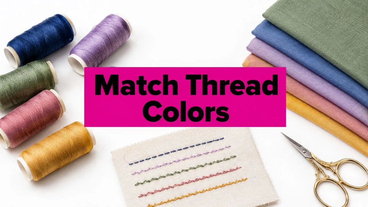
Before you pull candidates, decide on the job. Do you want the stitching concealed, textured but quiet, or clearly visible? Check the thread you're using now against your actual fabric, not the spool label. Pull a few inches off and lay it in a loose curve across the surface.
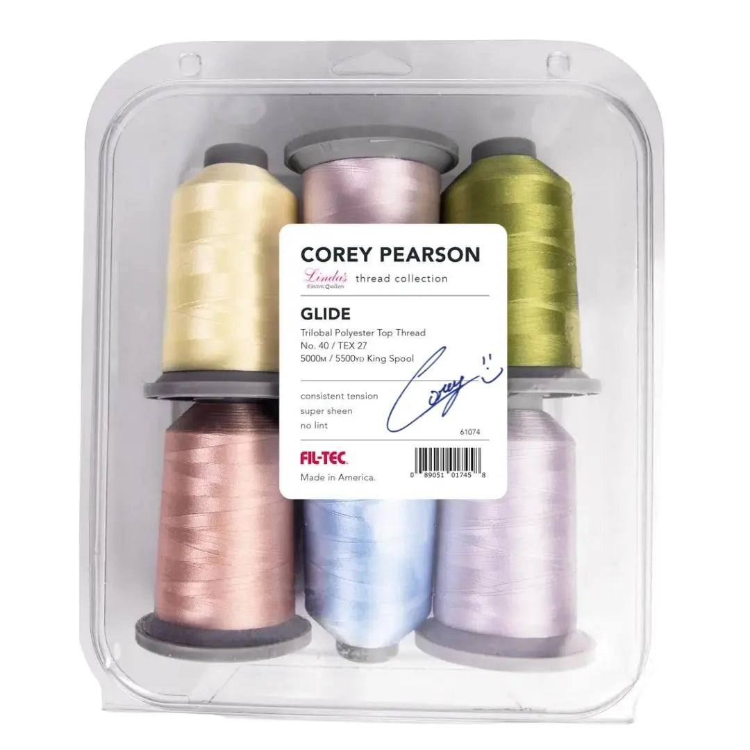
Then organize a small comparison swatch with two or three candidates instead of judging one spool in isolation. Note each shade number as you go, because memory is unreliable once spools go back in the drawer. If your stash has gaps, browse Linda's thread selection to fill the value steps you're missing, light, medium, and dark versions of the families you quilt most. Keep a basic notion kit nearby too, since clean clips and trimmed samples make comparisons honest.
Practical rule: if a thread looks right from six inches away but wrong from across the room, trust the distance where the finished piece will actually be viewed.
Thread Color Matching Goals by Project Type
| Project Type | Primary Goal | Evaluate First | Typical Choice |
|---|---|---|---|
| Utility longarm quilting | Concealment | Value against the top | Close value, low sheen |
| Decorative quilting | Visible texture | Contrast and loft definition | Controlled contrast |
| Piecing | Seams that don't grin | Value of adjoining pieces | Mid-value neutral or matched shade |
| Machine embroidery | Readability | Contrast at small scale | Stronger value separation |
That framework changes the question. You're not hunting for a perfect match in the abstract. You're choosing the right behavior for a specific stitch, on a specific fabric, under specific light.
Inspect the Thread and Fabric Before Comparing Shades
Slow down before you open a color chart. Most bad matches start with a rushed comparison, a spool held briefly against a folded corner of fabric under mixed shop lighting. You need a controlled look at both materials first.
Use the checklist below to set up a fair comparison before you narrow shades.
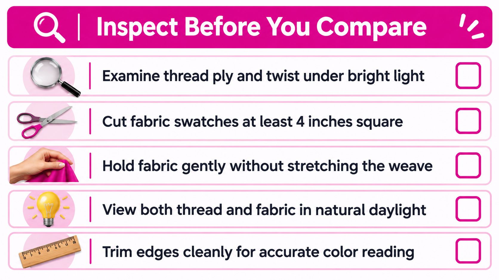
Prepare Honest Samples
Cut a fabric swatch large enough to show the character of the cloth, including print variation and any slubs or texture in the weave. A tiny clipping from one motif will mislead you if the quilt top moves through several values. Handle the swatch gently without stretching it, because a distorted weave shifts how light scatters across the surface.
Check both sides of the fabric. The back can be paler or duller, and that matters when you're quilting through to a backing or piecing where seam allowances may show. Unwind a length of thread and look at its ply and twist. A tightly twisted, smooth thread reflects light in a cleaner line. A softer, loftier thread diffuses it.
- Examine the print range: Identify the lightest, darkest, and most frequent values, not just one dominant color.
- Find the matte and reflective areas: Turn the swatch slowly and watch where the surface brightens.
- Compare on the exact area: Place thread where stitching will fall, not on a different yardage or a screen image.
- Note the hand of the fabric: Stiff, soft, or textured cloth changes how stitches sink or sit up.
Watch for Metamerism
Two colors can match under one light source and separate under another. That phenomenon is metamerism, and it's why a thread chosen under fluorescent shop lights can look wrong in a sunny living room. Guidance organized by stitch purpose and viewing conditions in this thread color matching overview reinforces why you shouldn't treat one quick look as final.
Compare candidates under the lighting where the piece will live, then check them again under a second source. If a match only holds in one light, it's fragile. Choose the candidate that stays believable in both, even if it's not the closest on paper.
Finish with a quick pass over texture, sheen, print range, and likely viewing distance. Once you know those four things, you're ready to pick shades with intention.
Choose the Match for Your Stitch Purpose
Longarm quilting, piecing, and machine embroidery don't share one matching rule. Applying embroidery logic to a whole-cloth quilt, or piecing logic to lettering, is how good thread gets blamed for a bad decision.
Longarm Quilting and the Top Versus Backing Question
Should quilting thread match the top or the backing? Start with the side that matters most visually. For most quilts, that's the top. Choose for the top first, then check how the thread reads on the backing and decide whether that contrast is acceptable or even desirable.
For low-contrast texture stitching, pick a thread close in value to the top so the loft and shadow of the quilting design do the work. The stitching shapes the surface without competing with the piecing. For a visible motif or outline, step the value away deliberately. Half-hearted contrast looks like a mistake. Clear contrast looks like a choice.
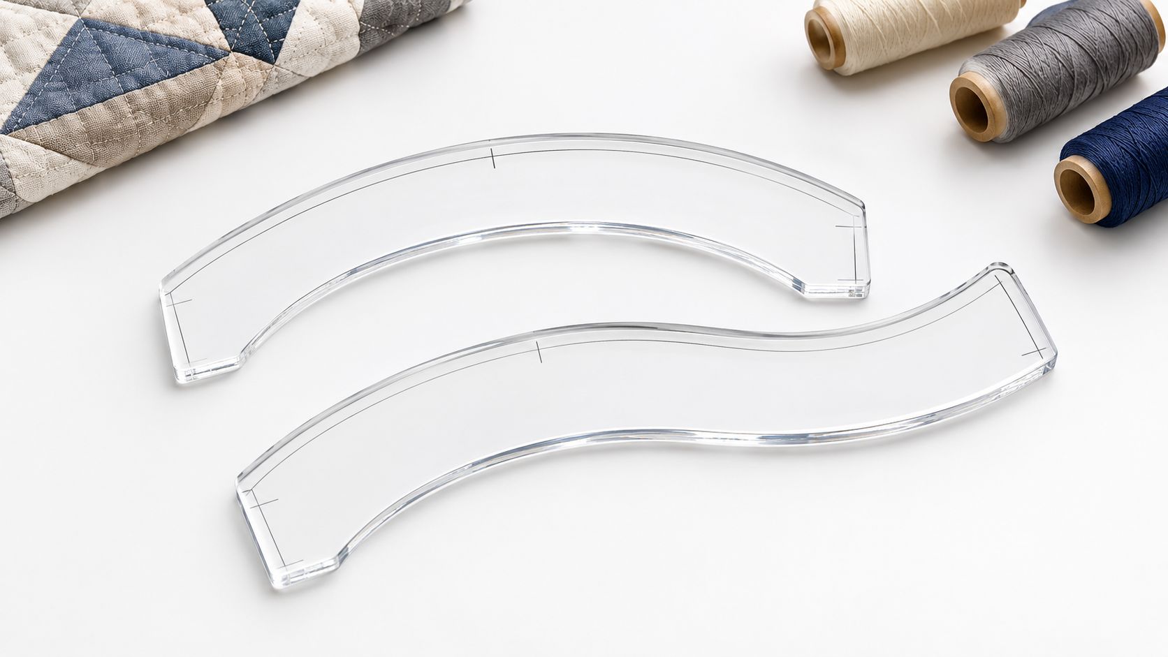
Ruler work makes this obvious. Stitching a curved crosshatch or a scalloped border with a tool like the Mini Curvit Ruler for Longarm Quilting, a clear acrylic curved ruler set with inside and outside curves, produces crisp lines that either whisper or stand out depending on your value choice.
Piecing Without Chasing Invisible Seams
Piecing thread mostly disappears into seam allowances, so perfection is wasted effort. What matters is that stitches don't grin through when seams are pressed and handled. Match the value of the pieces you're joining, or use a mid-value neutral when you're sewing across many colors.
With a directional print or strong value changes between patches, check the thread against the darker piece. A thread that's too light shows first against dark fabric when tensioning pulls the seam slightly open.
Embroidery Needs Value Separation
Embroidery flips the priority. Dense lettering and small motifs need enough value contrast to read at a glance, especially on stabilizer-backed fabric where the ground can look flatter. A thread that matches the fabric hue but sits at the same lightness will blur.
Broad fill areas behave differently. Dense stitching builds its own surface, so the thread's sheen and coverage dominate and the fabric underneath matters less. Judge fills by a stitched patch, not a strand.
Build a small purpose-specific swatch set, one card for quilting candidates and one for embroidery. When you browse Linda's threads, shop by the job on the card rather than by color name alone.
Build a Reliable Swatch and Record System
A match that lives only in memory fails the second time you need it. Spools run out mid-quilt, lots change, and a paused project can come back months later with no clue which gray finally behaved on the fabric. A card system turns one good decision into a repeatable setting at the machine.
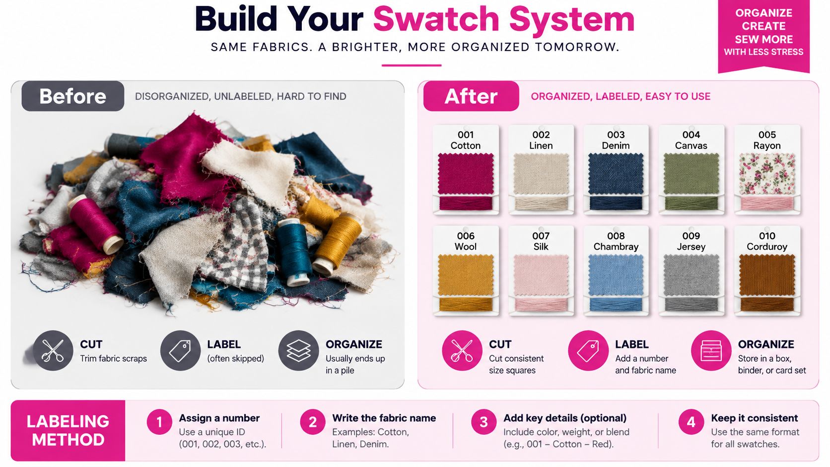
Cut, Wind, and Label Consistently
Cut fabric snippets at one size so comparisons stay fair. Wind several turns of each candidate beside the exact fabric it was tested against, because a single strand reads thinner and cooler than a stitched line. For quilting candidates, leave enough card space to note whether the thread was meant to sink into the seam or sit visibly on top; for embroidery, note the motif size and whether the ground was dense fill, lettering, or open fabric.
Label while the sample is still on the card. Record brand, shade number, lot when available, needle or bobbin pairing if it mattered, the project, and the call you made: conceal, blend, or contrast. Add the value step and the distance you judged from, plus the light source used for the final check. Those fields keep a later decision from being rebuilt by eye under different conditions.
Coded references exist for this reason. Pantone introduced its first Matching System in 1963 with 500 colors, and the library later grew to 747 colors by 1983 and more than 2,000 colors by 2022, as documented in this history of standardized color libraries. Thread shade numbers serve the same purpose in your sewing room. They are a repeatable language, though dyed goods can still vary by lot.
We tested this card system on an Innova longarm in our McKinney, Texas shop, and labeled value steps cut decision time at the frame.
What Each Color Matching Aid Can Tell You
| Matching Aid | Best Use | Limitation |
|---|---|---|
| Brand shade chart | Narrowing candidates by code | Printed or screened color isn't thread |
| Color wheel | Planning hue relationships and contrast | Says nothing about sheen or texture |
| Physical sample card | Judging real surface behavior in your light | Only covers shades you own or borrow |
Use charts to narrow the field and physical samples to decide. When a project matters, start from your cards and then reorder by shade number rather than by a descriptive name. Keep the winning spool or its label with the project until it leaves the machine.
Control Lighting Sheen and Color Distance
You've narrowed the field to two or three candidates. Now separate them by the variables that break matches at the machine, light, angle, distance, and surface shine.
The concept map below groups those checks so you can run them in order.
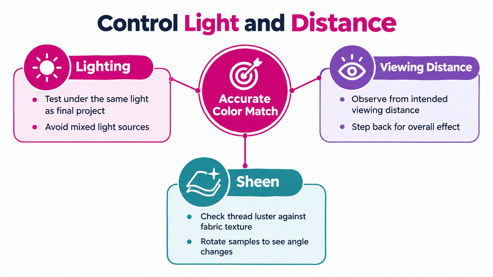
Test in the Light the Piece Will Live In
Avoid mixed light sources when you judge. A window on one side and a warm lamp on the other will split your sample into two readings. Stand under one consistent source, ideally the kind of light where the quilt or embroidered piece will be displayed or used.
Step back to the intended viewing distance. A bed quilt is read from several feet away, where small value differences merge. A monogram is read up close, where they don't. Squinting helps here. It strips hue detail and shows you the value relationship plainly.
Read Sheen as a Color Change
Gloss changes perceived color. A shiny thread can read lighter where it catches light and darker where it turns away, so a stitched line may flicker between two values as the quilt moves. On matte fabric, that flicker reads as brightness even when the measured shade is close.
Rotate your sample slowly under the light. If one candidate holds steady and another flashes, you have your answer for a quiet quilting thread. Save the flashing one for work where you want movement.
Pro-Tip: Lay several turns of thread directly on the fabric, then rotate the pair a quarter turn at a time under your final lighting. Reject any shade that only matches at one angle, no matter what the catalog promised.
Use Color Distance as an Aid, Not a Verdict
Measured color gives you a shared vocabulary. The Commission Internationale de l'Éclairage established the CIE XYZ color system in 1931, and modern textile matching commonly converts measurements into CIELAB, where the difference between thread and target is expressed as Delta E (ΔE) in this professional color matching guide. In practical guidance, ΔE below 1 is generally treated as imperceptible except under highly controlled observation, while values above 3 are typically clearly visible.
Treat those numbers as support, not command. Reported values shift with illuminant, observer, and instrument conditions, and no instrument knows your viewing distance or your fabric's texture. Let measurement confirm what your eyes see on a physical sample. Never let it overrule a mismatch you can plainly see.
Test Threads with Blended and Visible Stitches
A strand on a card is a prediction. A stitched sample is evidence. Before you commit to a quilt top or a hooped design, sew the actual stitch at the actual scale.
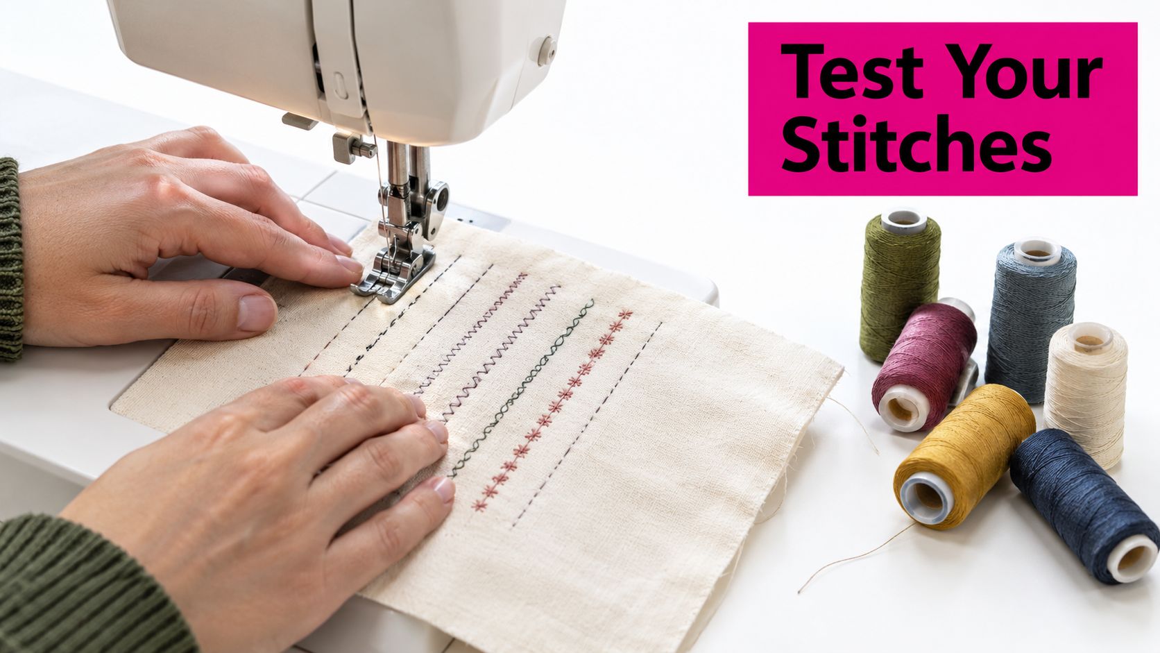
The photo below shows the kind of short, varied test runs that reveal more than any spool comparison.
Stitch the Sample That Matches the Job
Build a small sandwich or sample block that mirrors your project, same fabric, same batting loft for quilting, same stabilizer for embroidery. Then run each candidate in the actual format. Sew a few inches of utility quilting for concealment, a short motif for decorative work, one piecing seam pressed as you'll press the quilt, and a small dense fill or letter for embroidery.
A prewound bobbin and a short test run keep this cheap. You'll see thread delivery, stitch density, and how the bobbin thread behaves at the surface. Check tensioning on the sample, not the quilt. If bobbin thread pulls to the top, you'll be judging two colors instead of one, and no shade choice survives that.
- Judge density with care: Dense stitching deepens color because less fabric shows between stitches.
- Press piecing samples: Heat and pressure change how much seam thread reveals itself.
- View from working distance and room distance: Both readings matter, but weight the one that matches final use.
Blend When a Straight Match Fights You
Sometimes no single spool sits right across a print that swings light to dark. A slightly muted thread, or one nudged a value step toward the middle of the print's range, often settles better than a strict match to one motif. A two-thread blend, alternating related shades in different areas of a quilt, can also soften transitions. Keep blend choices conditional and test them, because there's no universal formula that fits every fabric.
For longarm and free-motion work, think about where the eye travels. File visible stitching along the design's natural paths, in ditches, along motif edges, or in echo lines, so placement supports the color decision instead of exposing it.
Keep your test area tidy as you clip between candidates. Small, easy-to-handle scissors such as Slice Self-Opening Scissors help you snip thread tails cleanly during testing without disturbing the sample. Browse Linda's notion selection when you restock the small tools that keep test stitching fast and your samples readable.
Verify the Finish and Shop the Right Supplies
You're ready to stitch the piece. Verify like a troubleshooter, not an optimist. Most late-stage surprises have ordinary causes you can check in minutes.
Thread Color Matching Troubleshooting Guide
| Symptom | First Check | Likely Correction |
|---|---|---|
| Match looks too bright | Sheen and stitch density | Choose a matter thread or deepen value slightly |
| Match looks too dark | Perceived lightness against fabric value | Step one shade lighter |
| Result looks mottled | Print variation across the stitch path | Pick a mid-value that bridges the print |
| Color shifts after stitching | Tensioning and bobbin show-through | Rebalance tension and retest on a sample |
If the color shifts only after stitching, look at the machine before the spool. Check thread delivery through the path, the bobbin casing for lint or damage, and whether the fabric was stretched during handling. For embroidery, confirm that needle and stabilizer suit your specific design and fabric. Those settings are machine and project specific, so verify them against your own equipment rather than copying universal numbers. Linda's Electric Quilters in McKinney, Texas stocks threads, batting, notions, and longarm supplies, and its team can help you sanity check a sample before you commit yardage and hours.
Final Checklist and FAQ
- Sample stitched: You tested the stitch at full scale on fabric.
- Light verified: The match held under final lighting and a second source.
- Distance checked: It reads correctly where the piece will be viewed.
- Record saved: Brand, shade number, and lot are written on the project card.
Are shade codes reliable enough to skip testing? No. Codes make reordering repeatable, but thread and fabric reflect light differently and lots can vary, so always confirm with a physical sample.
Should quilting thread match the top or the backing? Match the side that carries the visual weight, usually the top, then accept or intentionally use the contrast on the back.
Why does matched embroidery thread still look too bright? Sheen and dense coverage usually cause it. The hue is close, but the glossy, built-up surface reflects more light than the fabric.
When should I use a blended option? When one shade can't sit comfortably across a print's full value range, a mid-value or two related shades tested in place often read calmer.
Use FAQPage schema markup for these four questions when publishing, and pair this guide with a related tutorial and your thread and batting categories so readers can move straight from testing to finishing.
Put this system to work on your next quilt or embroidery project, test first, record everything, and stitch with confidence. Shop threads, batting, notions, and longarm supplies at Linda's Electric Quilters, and bring your sample cards so you leave with exactly the shades your project needs.