Good morning, quilters!
After you've made a few quilts, fabric selection starts to change.
You stop asking only, "Do these colors go together?" and start asking, "What job does each fabric need to do?"
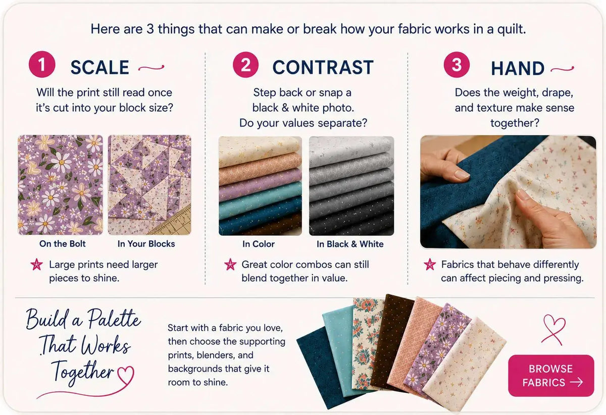
A focal print, background, blender, and accent all interact differently — and checking three things before a fabric goes into your pull can help you build a quilt with more clarity and intention.
The 3-Point Check
📏 1. Scale
How big is the print? Large-scale prints make beautiful focal fabrics but can lose their design when cut into small pieces. Small-scale prints and near-solids read as texture from a distance, which makes them perfect blenders and backgrounds. Look at the fabric from across the room — that's how your finished quilt will be seen.
🎭 2. Contrast
Does it stand apart from its neighbors, or melt into them? Contrast — in value more than color — is what makes a pattern visible. Snap a quick black-and-white photo of your stack: if two fabrics blur together, your piecing will too. Every quilt needs lights, mediums, and darks doing their jobs.
✋ 3. Hand
How does it feel? "Hand" is the drape, weight, and finish of the fabric. A crisp quilting cotton pieces beautifully; something too loose or too stiff can fight you at the machine and change how the finished quilt drapes. If it doesn't feel right in your hand, it won't feel right in the quilt.
Corey's Quilting Tip 💡
Put the 3-Point Check to work as you browse our fabric collection. Don't just ask "Is it pretty?" — ask "What will it do in my quilt?"
That small shift can completely change the way you build your next fabric pull.
Remember This
Pretty gets a fabric into your cart. Scale, contrast, and hand are what earn it a place in your quilt.
Happy Quilting!
— Corey