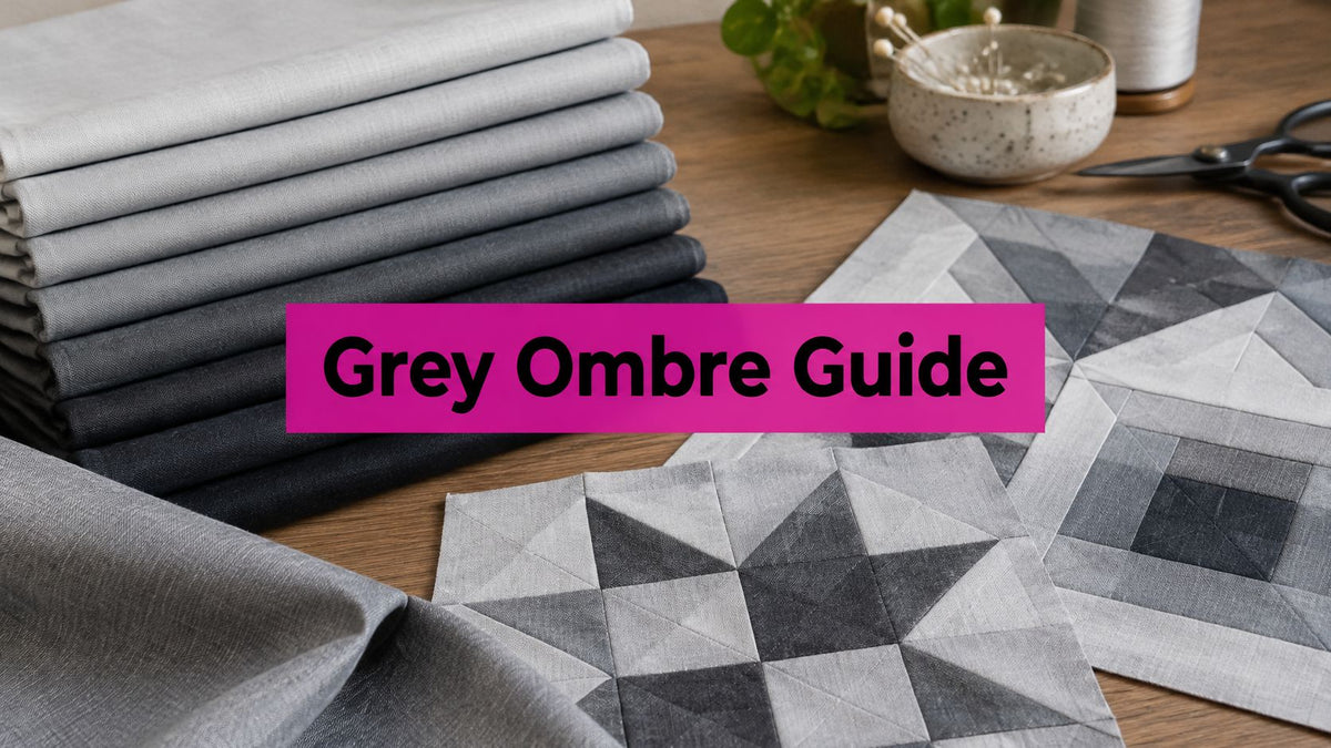
You've unrolled a bolt of grey ombre fabric, admired the sweep from silver to charcoal, and then paused. Which way should the gradient run, and will the pale end still match after washing? That's the true skill with grey ombre fabric. It's not just a pretty grey. It's a controlled tonal gradient you have to place, cut, and care for so the light, mid, and dark values stay in balance.
What Grey Ombre Fabric Is and How It Is Made
Grey ombre fabric is a textile with a controlled tonal gradient, usually moving from pale silver or light grey at one side to charcoal or near-black at the other. Think of a sky darkening toward the horizon. There's no hard line, just a steady deepening of value.
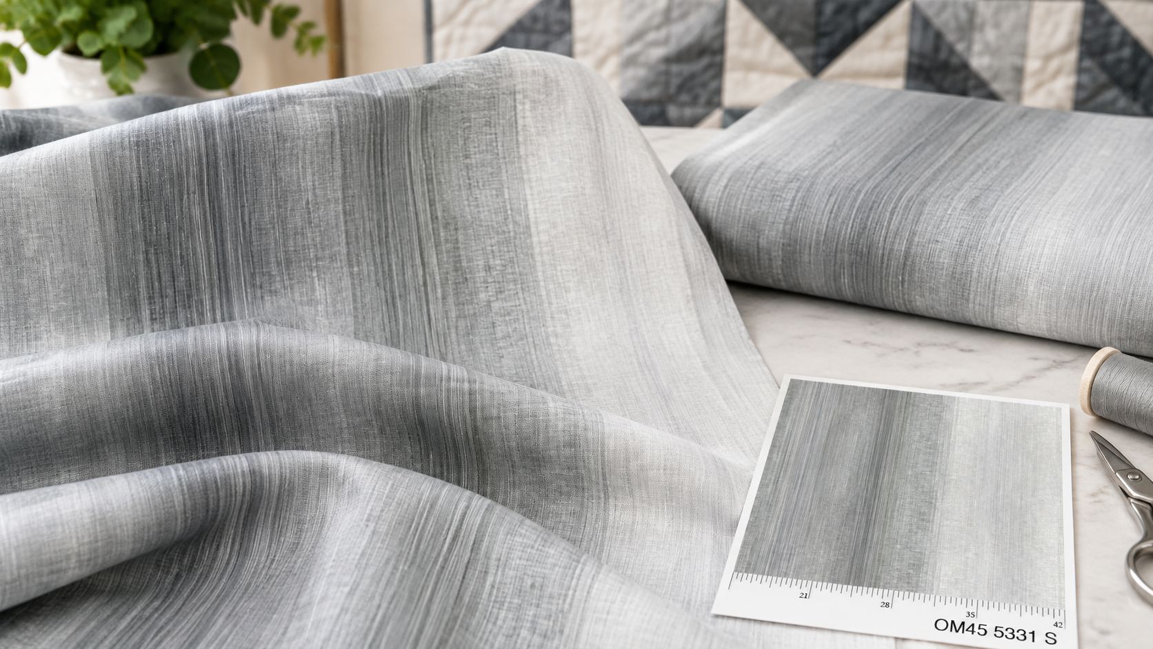
Makers create that shift in three main ways, and the method affects how even your cut pieces will be. The Penn State Extension history of textile dyes notes that dyes have been used for more than 4,000 years, and contemporary ombre effects come from changing concentration, layering shades, or printing.
- Progressive dye concentration: The cloth is lowered into dye in stages, so the first-dipped end spends longest in the bath and deepens most.
- Several shades applied in stages: Different grey values are laid down in sequence and blended where they meet.
- Digital or screen printing: The gradient is printed onto the surface, which gives a repeatable transition along the bolt.
Grey suits quilters because it adds depth and movement without a strong hue. It sits comfortably beside most palettes, so you can build shading into blocks and borders without fighting your other fabrics.
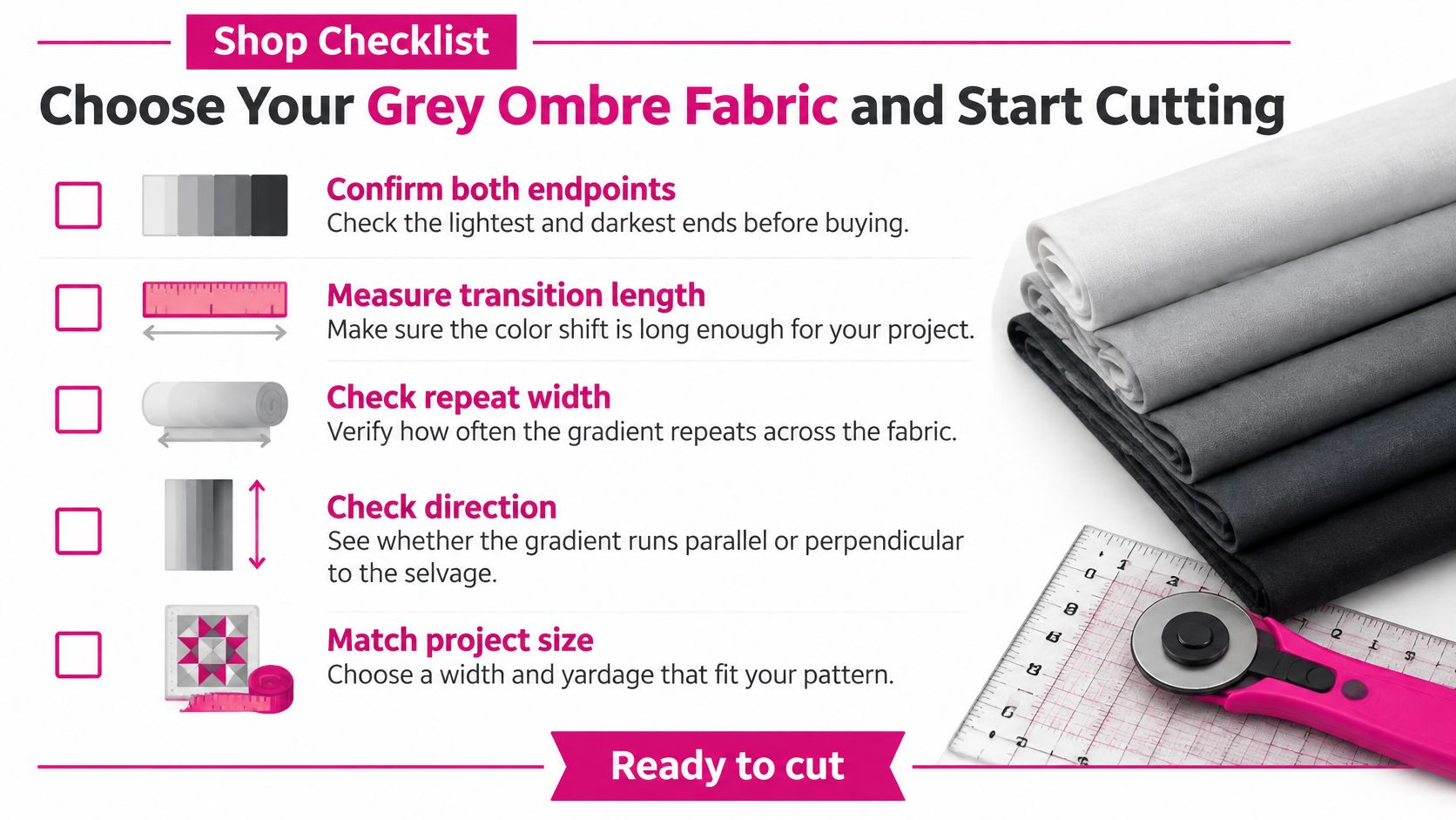
Learn five terms before you shop, because they'll decide your cutting plan. Endpoints are the lightest and darkest values. Transition length is the distance the grey takes to travel between them. Repeat width is how often that full sweep repeats across the cloth.
Tonal direction tells you which way value increases. The selvage is the finished edge, and the gradient may run parallel or perpendicular to it. Judge a bolt by its transition length and direction, not only by a light and dark swatch, because a short transition can look striped in a large block while a long one may never reach charcoal in a small piece.
Printed, Dyed and Collection Ombre Compared
A quilter choosing grey ombre fabric is really choosing how the gradient was put on the cloth. Four forms turn up on shop shelves, and each one changes what you can cut and how much control you have over the transition.
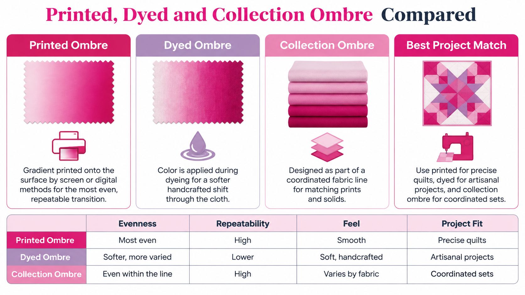
| Type | How the gradient is made | Consistency | Best use | Main watch-out |
|---|---|---|---|---|
| Printed ombre | Screen or digital print across the surface | Very even along one bolt | Blocks, borders and bindings | Check both ends match across cuts |
| Dip-dyed or hand-dyed ombre | Staged immersions in dye, four to six depth zones | Softer but less predictable | Art quilts, wall hangings and panels | Shade can vary from piece to piece |
| Gradation collection | Several separate grey values sold as a set | Consistent within each value | Piecing a gradient from separate fabrics | Values must be ordered to avoid jumps |
| Wideback ombre | Continuous gradient across a wide backing width | Consistent across the usable width | Backings and large panels | Confirm width and fiber on the listing |
Printed ombre
Printed ombre lays the gradient onto the surface by screen or digital printing. It can be very even and repeatable along one bolt, which helps when you are cutting matching blocks, borders or bindings from the same length. Still check both ends across separate cuts. A second bolt can land on a different grey even when the print repeat looks the same, and that difference will show in a border.
Dip-dyed and hand-dyed ombre
Dip-dyed ombre is built in staged immersions. One documented method in Textile Tuts' ombre dyeing guide uses four to six depth zones at 5 to 10 minutes per step, with rinsing in cold water until it runs clear. You get a softer, more handmade shift, but pieces can vary slightly, so this type suits art quilts and panels better than precision matching.
Gradation collections and widebacks
A gradation collection is several separate grey values sold as a coordinated set. You build the ombre by piecing them in order, which gives you control over each step. Sort lights, mediums and darks, then check the run in a black-and-white phone photo so a too-dark piece does not create a jump.
Wideback ombre gives you one continuous sweep for backings and large panels, where a seam would break the transition. The Gray Slate Stonehenge Ombre Cotton Wideback Fabric Per Yard is listed as a wideback. Confirm the exact width, fiber content and manufacturer details on the product listing before you plan a backing around it. That check matters because the gradient has to span the quilt, not just the sample in your hand.
Across all four types, treat the choice as a color-management decision. The endpoints set your lightest and darkest grey, the transition length decides how quickly the fabric travels between them, and tonal direction tells you which way to lay your strips. A pretty swatch can hide a short transition or a direction that fights your block layout. Check those three things first, then ask how the gradient will look after washing and sun exposure. A print and a dye bath can both change with time, so test a sample the way you plan to wash the quilt before you commit the whole bolt.
For a large gradient, buy one continuous bolt when the design allows it. Choose a collection when you want to build the gradient from separate blocks on purpose.
Weight and Width for Quilting Grey Ombre
Two grey ombre bolts can look identical on the shelf and behave like different fabrics under the needle. Width decides how many gradient strips come off one cut. Weight decides how the cloth drapes on the bed and how it feeds under a longarm. Neither number shows up in a swatch photo, which is why the label deserves more attention than the colour card.
Standard quilting cotton is the safest base for grey ombre fabric because its stable weave protects block geometry. quilting fabric quality research compiled by Jared Watkins puts the baseline at 100% cotton plain weave, about 42 to 44 inches wide and 4 to 6 oz/yd² (135 to 203 g/m²), commonly near 60 to 68 warp and weft threads per inch.
| Specification | Typical value | Effect on the gradient |
|---|---|---|
| Fiber and weave | 100% cotton, plain weave | Stable geometry that limits stretch |
| Width | 42 to 44 inches (standard quilting cotton) | Sets strips per cut and yardage needed |
| Weight | 4 to 6 oz/yd2 (135 to 203 g/m2) | Drape, handling and longarm feed |
| Thread count | Roughly 60 to 68 warp and weft threads per inch | Seam stability and cutting accuracy |
| Hand | Firm and even, minimal slippage at cut edge | Keeps gradient strips straight |
| Shrinkage | Measured in both grain directions after test wash | Prevents waviness across the transition |
Think of width as the runway the gradient gets to travel on. A wider cut gives the shift more inches to cross, so each step in value is smaller and the eye reads a smoother sweep. On a narrow cut, the same tonal range compresses into fewer inches and the change per block looks abrupt. That is why width is a colour-management decision, not just a yardage one.
Weight changes drape, pressing behaviour, and how the cloth feeds under a longarm. Thread count signals seam stability and cutting accuracy, because a denser, even weave holds a clean edge and resists distortion when you press seams open or to one side.
The hand test before you buy
Look for a firm, even hand with minimal slippage at a cut edge. Loosely woven cloth frays and stretches, and heavily stiffened cloth can soften unevenly after washing. Either problem creates waviness across adjoining strips, and waviness interrupts a smooth tonal transition even when the colours are right.
Before committing to a quilt, run this short sequence on a representative piece. It is the same check experienced quilters run before loading a top on a longarm.
- Cut a sample: Take a piece that includes light and dark zones, and record its measurements.
- Test wash it: Wash and dry it as the finished quilt will be treated, then measure dimensional change in both grain directions.
- Press it hard: Use the heat and moisture you plan for production, then check for rippling, shrinkage, or distortion.
If one direction shrinks more than the other, adjust your cutting plan or pre-wash the full yardage. A gradient cannot look smooth if the cloth underneath it will not lie flat. Uneven shrinkage does something sneakier too: it shortens one end of the transition relative to the other, so a wash can steepen a gradient you carefully planned.
Placing the Gradient in Blocks and Borders
Decide direction before the rotary cutter touches the cloth. A gradient running parallel to the selvage gives even horizontal or vertical bands along the length. A gradient running perpendicular to the selvage lets tone flow across the width, which suits blocks cut side by side.
Two bolts can carry nearly identical greys and still behave differently on the design wall, because what you are managing is the pair of endpoints and the distance between them. A bolt that drifts from pale smoke to near-black across forty inches gives a slow, legible sweep. A bolt that travels its whole range in a foot turns banded the moment you cut blocks and shuffle them. Measure the transition, not just the swatch.
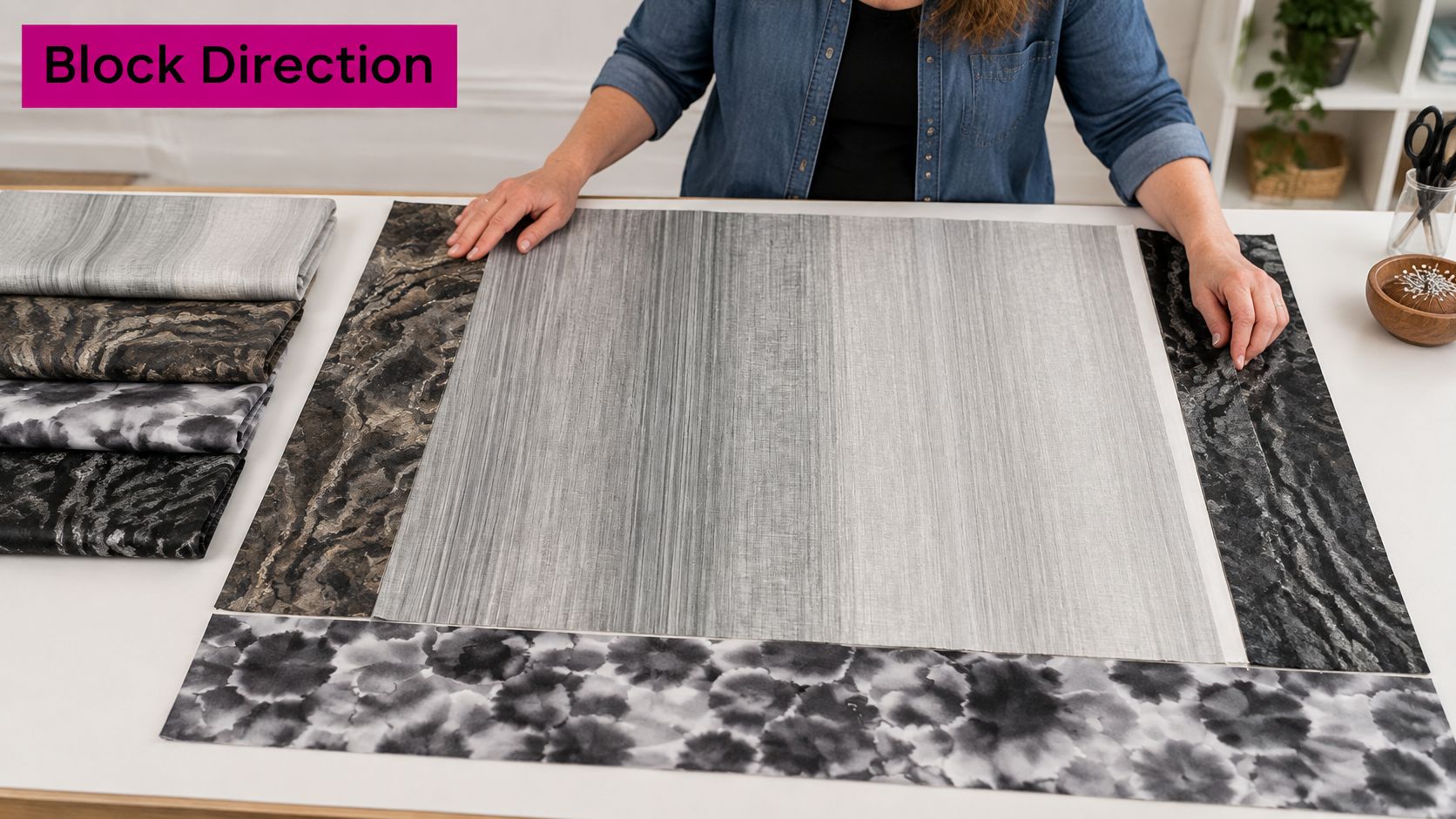
Mark the tonal direction on the wrong side with a small arrow on painter's tape. It sounds fussy until you have sewn half a row and realized one block runs dark to light while its neighbor runs light to dark. Add the position as well: "near selvage," "middle," "far edge." Linda's instructional videos show this labeling at the cutting table, so the marks are easy to copy on your own bolt before the first strip comes off.
Placement ideas that work
- Appliqué from different zones: Cut leaves, petals, or geometric motifs from pale, mid, and charcoal areas of one bolt so shading comes from the cloth itself.
- Gradient border: Place the lightest value at the inside edge and the darkest at the outside to frame and ground the center.
- Strips in value order: Piece narrow strips from light to dark for a quiet sunset or storm-sky effect without adding new colors.
- Ombre binding: Cut binding along the transition to lift a solid or low-volume quilt with a changing edge.
Coordinate by value first, not by guessing at grey names. Pair charcoal ends with pure white or cream for crisp contrast, and pair mid-greys with solids in the same value family for a calmer look. Add one muted accent hue rather than several, so the gradient stays the feature.
Don't mix two different grey gradients in one focal unit. Two transitions that reverse or change at different rates read as a mistake, even if each fabric is lovely alone. Save the second ombre for a backing, binding, or a separate panel where it can run uninterrupted. Photograph the layout and look at it in greyscale, too. Tone disappears into the background when you are staring at shapes, and the camera separates them again.
Watch your tensioning and bobbin casing when you quilt across value changes, too. Light thread can disappear on silver and shout on charcoal, while dark thread does the opposite. Stitch a sample across all three zones and check the loft and stitch definition before you commit to the whole top.
Pro-Tip: Keep one tonal direction per focal unit, and photograph the bolt with its direction labeled before cutting. That photo saves you when pieces move between the design wall, presser foot, and longarm frame.
Project Ideas That Showcase a Gradient
Good ombre projects give the transition room to travel. Small, chopped-up pieces can lose the sweep, while larger blocks, borders, runners, and panels let the eye follow grey from pale to dark.
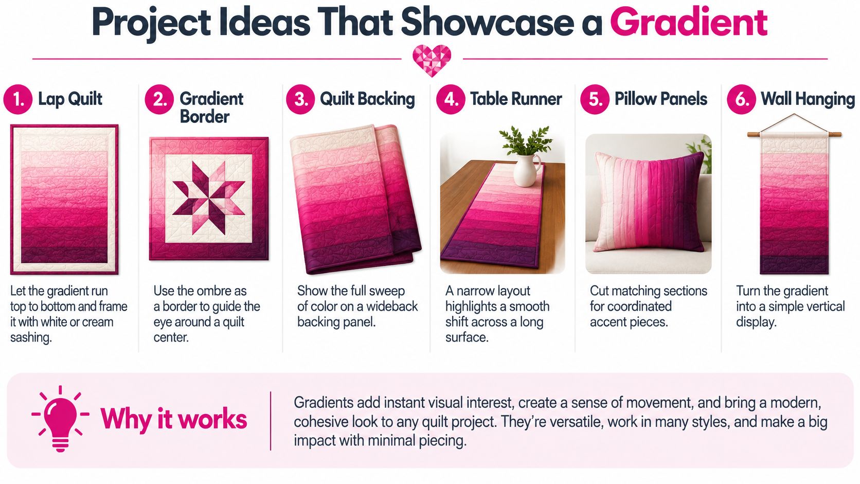
| Project | Where the gradient works | Coordinating partner | Skill level |
|---|---|---|---|
| Lap quilt with gradient blocks | Light to dark from top to bottom | White or cream sashing | Confident beginner |
| Gradient border quilt | Lightest at inside edge, darkest at outside | Neutral or print centre | Beginner |
| Strip-pieced runner | Strips in value order | Charcoal solid binding | Beginner |
| Appliqué wall hanging | Motifs cut from different zones of one bolt | Muted accent colours | Intermediate |
| Pillow covers | Single gradient panel | Plain linen or cotton | Beginner |
| Quilted tote | Gradient outer panel | Solid lining with contrast webbing | Beginner to intermediate |
A lap quilt with gradient blocks works best when the value change runs top to bottom and white or cream sashing frames each block. The sashing gives your eye a rest, so the shift reads as intentional rather than muddy. Number rows before sewing, because mid-greys are easy to swap.
A gradient border quilt is gentler for beginners. Keep the center neutral or printed, then let the border carry all the tonal movement. You don't have to match the gradient inside every block, and long border strips show the transition clearly.
A strip-pieced runner is the fastest way to learn value order. Sew strips from pale to charcoal, press carefully so seams stay straight, and finish with a charcoal solid binding. That dark edge anchors the lightest strips and makes the runner look finished on a pale table.
For an appliqué wall hanging, cut motifs from different zones of one bolt and place paler shapes higher or farther back. You'll get depth from value alone, then add muted accents sparingly. It's a strong intermediate project because placement, not complicated piecing, creates the effect.
Pillow covers make an ideal first project. Use one gradient panel over plain linen or cotton, quilt it lightly, and you'll see how the cloth presses and stitches before risking a full quilt. A quilted tote works the same way at a slightly larger scale, with a gradient outer panel, solid lining, and contrast webbing for structure.
Pick two projects, one that matches your current skill and one that stretches it. In your first session, write the cutting order for each and label which end of the grey ombre fabric is light. That small plan prevents most reversed panels.
Caring for Grey Ombre Fabric Without Losing the Gradient
Don't treat colorfast as one all-purpose promise. For grey ombre fabric, separate washing fastness, crocking, and lightfastness, because each one can fail in a different way. The ISO 105-X12 standard for colorfastness to rubbing evaluates dry and wet rubbing separately, and wet rubbing matters during steam pressing, laundering, and handling with damp hands.
Test both the pale and charcoal ends. A slight change in only one segment makes pieced blocks look uneven, even if the fabric doesn't obviously bleed. Request a continuous cut or verify bolt continuity, then work through these checks in order.
| Test | Method | What to look for |
|---|---|---|
| Dry crocking | Rub a white cloth across the fabric | Colour transfer onto white |
| Wet crocking | Damp white cloth, ISO 105-X12 approach | Transfer that could stain pale neighbours |
| Drop test | Several drops of water, press with white cloth, repeat three times | Any colour on the cloth means no wet cleaning |
| Detergent test | Same method with laundry detergent solution | Bleeding between gradient sections |
| Washing fastness | Wash a sample under the intended care | Shift in balance between light and dark |
| Lightfastness | Expose a sample to light beside a shaded control | Fading, often faster at the pale end |
For the drop test, the University of Georgia textile care guidance recommends several drops of the intended water pressed with a white cloth and repeated at least three times, then the same test with detergent solution. If any area transfers color, don't wet-clean that piece, because washing may cause bleeding between gradient sections.
Light deserves its own check. A textile dyeing study in Discover found lightfastness for light shades was only poor to fair, while medium and dark shades were rated fair. So yes, your pale end may fade faster than the charcoal end, and prolonged direct sunlight can flatten the balance you worked to create.
Before cutting, request the manufacturer's colorfastness and rubbing-test information rather than trusting a screen color. Test both ends, include a light neighboring fabric in the wash sample, and photograph the grey ombre fabric before and after washing. Display heirloom quilts away from prolonged direct sun, and rotate wall hangings if one side receives more light.
Grey Ombre Fabric Questions Quilters Ask
How much yardage should I buy for an ombre quilt back? Work from the finished back, not from the quilt top. Measure the width and length you need, then add allowance for the longarm frame and trimming. A 108-inch wideback is bought by length, so the math stays simple. With 44-inch fabric, you need two or three lengths, and the seam becomes part of the design. Decide where that seam falls in the gradient before you order. A backing that runs light to dark across its width needs a different cut than one that runs head to toe. The swatch shows one point on the ramp, not the whole run.
Why does my gradient change after piecing? Flipping a piece reverses its tonal direction. A ramp turned around puts its low end at the top. Ombre fabric behaves the same way. Before sewing, lay the cut pieces on the design wall and check that the gradient still steps in one direction. If a block must rotate, the sequence may now zigzag. The fix is usually layout, not recutting.
How do I keep a border transition smooth? Cut border strips as one continuous length when the repeat allows. If you must piece, join strips where the values match, not only at the ends. A mismatched join shows as a visible band in the gradient. Lay the strips end to end on the design wall and step back. The transition should read as one slow change, with no sudden jump between light and dark.
Can I mix grey ombre with solid greys? Yes, if the solids match the values in the ombre rather than the bolt name. Pull a light silver that matches the pale end and a charcoal that matches the dark end. Compare them in daylight, because shop lighting can make two greys look closer than they are. Use the solids to extend the gradient beyond the fabric's width or to quiet a busy section. Keep the same tonal direction so the eye reads one continuous ramp.
Choose Your Grey Ombre Fabric and Start Cutting
Unfolding a grey ombre bolt is the moment the decision becomes physical: where the silver stops, where the charcoal starts, and how much fabric the fade takes. Treat the bolt as a color-management sheet. Compare both endpoints against the sashing, binding and backing you plan to use. A silver that looks neutral on the bolt can turn green beside a cool grey solid, and charcoal can go flat under warm room light. Then measure the transition length. A short fade shows only a slice inside a small block. A long fade needs a wide border or a full runner to read as a gradient. Confirm whether the repeat runs parallel or perpendicular to the selvage too, because that decides whether your border strips carry the fade lengthwise or crosswise.
For a standard-width starting point, the Grey Ombre 44"/45" Fabric Per Yard is 100% cotton from P&B Textiles, 44 to 45 inches wide, and listed as a single grey ombre colorway. If the back needs one continuous sweep, a 108-inch wideback removes the seam that would break the fade. Linda's sells fabric by the yard, as fat quarters, pre-cuts and panels, plus wideback backing fabric and quilt batting that can be paired for a complete project.
Yardage math should follow the gradient rather than fight it. For borders, measure the longest dimension first, then add seam allowance and a few inches for squaring. If the fade runs across the width, you may need two lengths to keep the light end at the same corner. If it runs along the length, one continuous cut can carry the transition from corner to corner. Sketch the cut list on graph paper and shade the dark half. That simple visual catches reversed pieces before the rotary cutter does.
Before you calculate borders and backings, use this guide to choose fabric by the yard to check usable width and continuous cuts. Order enough length to match the fade at seam lines; a spare strip is easier to justify than a reversed border.
At the counter, ask whether the grey ombre is printed or dyed. The transition can soften differently after washing or sun exposure, so match the method to the look you want and the care you can give the finished quilt.
Shop grey ombre fabric, wideback backings, batting, and the notions that finish the next quilt at Linda's Electric Quilters. Pick the gradient, pair it with backing and batting, and cut the first block with the endpoints already settled.