Choose thread by value, not exact color, and start with a neutral library of at least 8 options. For most versatile quilting work, audition 6–8 threads, narrow them to 2–3 finalists, and test those across the lightest, darkest, and midtone fabrics before stitching.
You're standing beside the longarm with a quilt top draped over the frame, three promising cones nearby, and a fabric match that looked perfect under store lighting. On the quilt, though, the thread seems too bright in one block, too dark in another, and unexpectedly shiny across the background. Knowing how to choose thread color for quilting saves time, thread, and tension adjustments.
The most reliable approach treats thread as a supporting design element. It should reinforce the quilting pattern without taking attention away from the fabric, unless you deliberately want decorative contrast. Color matters, but lightness, darkness, weight, and sheen usually determine whether the stitched line blends or announces itself.
Why Value Matters More Than Exact Color
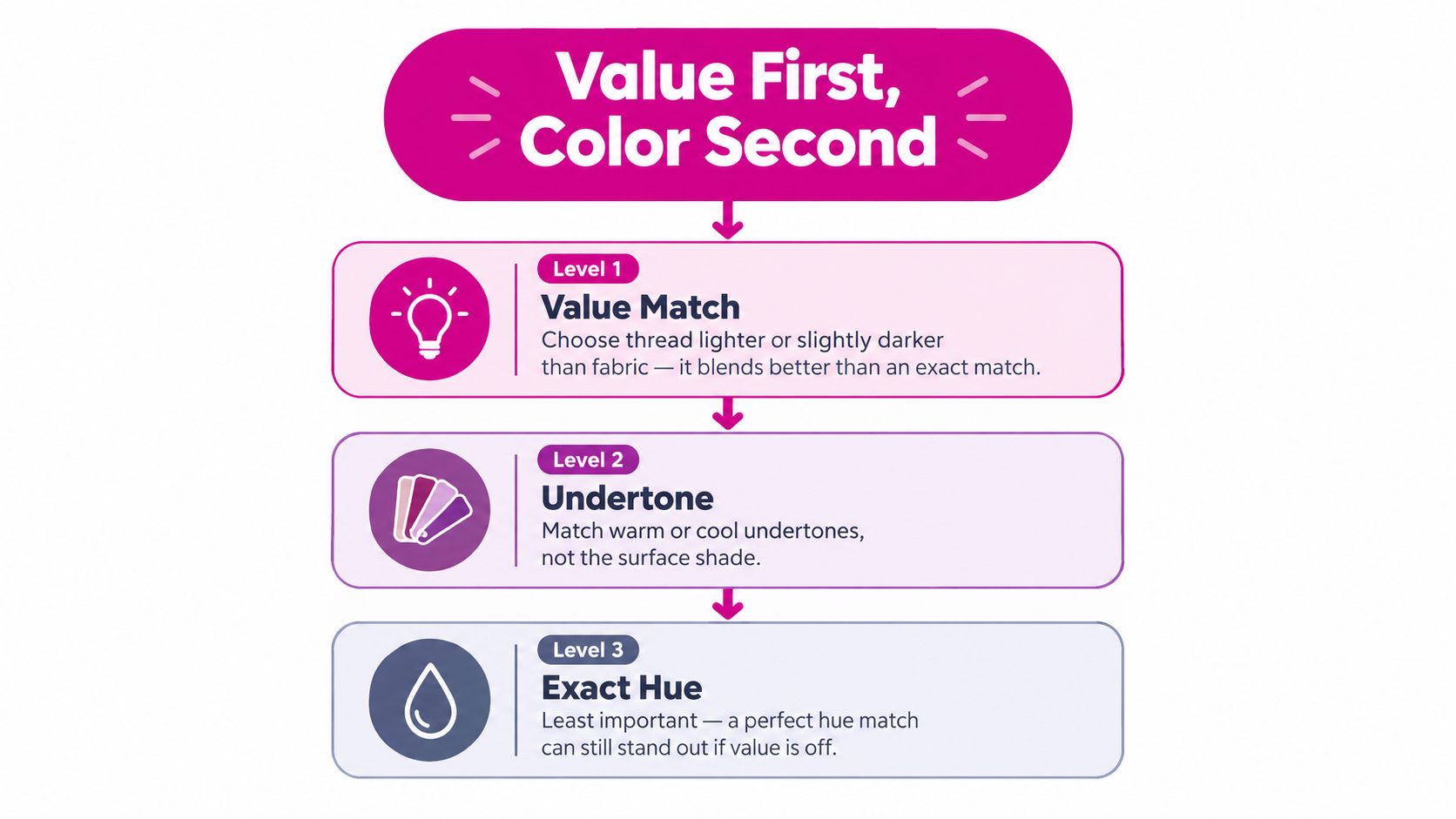
Under longarm lighting, a thread can look like a close color match on the cone and still stitch too strongly across the quilt. Value, the apparent lightness or darkness of a color, usually controls whether the quilting blends into the fabric. Matching value before hue gives production quilters a more dependable starting point than chasing an exact shade.
A thread with the right value can settle across several fabrics, while an exact blue or green may disappear in one block and stand out everywhere else. Medium gray, off-white, cream, taupe, and similar neutrals often support the whole composition without favoring a single fabric. This matters on customer quilts, where changing cones for every fabric collection adds thread cost, setup time, bobbin checks, and another opportunity for tension adjustments.
A practical guide to choosing a quilting thread color recommends auditioning 6–8 options and narrowing them to 2–3 finalists. Test thread on the quilt top itself. A cone viewed upright under shop lighting behaves differently from a strand lying flat beneath the longarm's needle light, especially once stitch density and fabric texture enter the picture.
Build a neutral library first
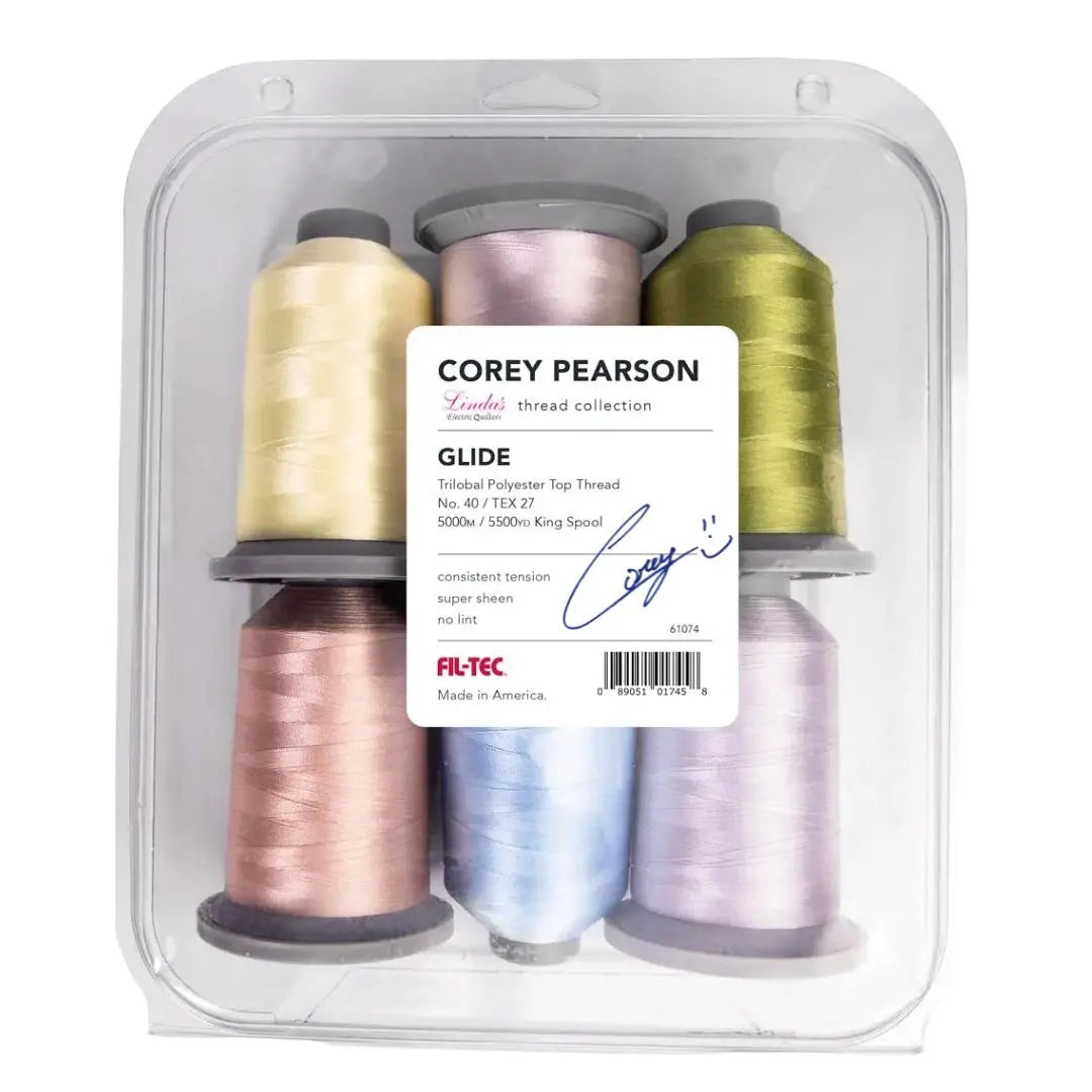
A production-minded cabinet starts with coverage, not a separate exact match for every collection. Begin with black, dark gray, light gray, brown, tan, taupe, ecru, and white. Those 8 neutral choices handle a wide range of customer quilts and reduce unnecessary cone changes. APQS outlines this neutral thread approach for quilting businesses.
The best neutral depends on value and the surrounding fabrics. Taupe may blend across cream, brown, dusty blue, and muted green more gracefully than a specific beige. Medium gray can work in both cool and warm compositions when its lightness is appropriate. Mixed values, busy prints, and multiple backgrounds often expose the limits of exact-hue matching.
Practical rule: If the quilting line looks too visible from normal viewing distance, check value before changing the pattern, tension, or bobbin casing.
Use your eyes the way a quilter does
Squint at the quilt to reduce small hue differences and reveal value contrast. View it from a distance as well. A thread that seems quiet at arm's length may form a prominent stripe across a broad background.
Hue still affects the finish, particularly on solids and large areas of one fabric. Warm and cool undertones can shift the appearance of a neutral. Yet between a perfect blue that is too dark and a muted gray with the correct value, the gray is usually the safer choice.
On a traditional pieced quilt, a value-compatible neutral keeps the fabric in charge. On a modern geometric quilt, the same test helps determine whether visible quilting is deliberate. Ask whether the line should be noticed in that area, then choose the cone that supports that decision.
Matching vs Contrasting Thread Strategies
Blending and contrasting are both valid. The mistake is choosing one by habit instead of deciding what the quilt needs.
A blending strategy uses a thread close in value to the surrounding fabric. Tan or gray often works across several fabrics and keeps the quilting texture subordinate to the piecing. This approach is dependable for scrappy quilts, traditional blocks, customer quilts where the fabric design should lead, and dense patterns where too much thread contrast could make the surface look busy. A neutral quilting thread guide from Smarter Fabric also identifies tan and gray as practical choices across multiple fabrics.
A contrasting strategy makes the quilting pattern part of the visual statement. Dark thread on a light background can emphasize a grid, feathers, arcs, or custom ruler work. Colored thread can highlight a feature block, outline appliqué, or turn a simple free-motion design into a decorative surface treatment.
The trade-off is visibility. Contrast can expose uneven stitch length, inconsistent spacing, or tension problems that a blending thread would soften. On the other hand, a well-tensioned stitch line with deliberate contrast can give a modern quilt its structure and movement.
| Thread Strategy | Best For | Neutral Palette Needs | Visual Effect |
|---|---|---|---|
| Blend by value | Scrappy quilts, traditional piecing, dense quilting | A broad neutral selection, including gray, tan, taupe, ecru, and white | Quilting recedes and fabric remains dominant |
| Contrast by value | Modern solids, geometric quilting, feature blocks | One darker or lighter option selected against the background | Stitching defines the design and becomes more visible |
| Decorative color | Appliqué, show quilting, expressive free-motion work | Colored threads chosen for intentional emphasis | Color and quilting share visual attention |
When matching works best
Suppose a quilt contains cream background fabric, tan piecing, muted brown prints, and a few pale blue accents. An exact cream thread may look right on the background but disappear unevenly across the tan and brown pieces. A soft taupe or light gray with a compatible value can create a more continuous surface.
The same principle applies to backing fabric. A thread that blends on top may stand out sharply on the backing, especially with a high loft batting or a dense quilting design. Always consider whether the bobbin thread should match the top thread, coordinate with the backing, or remain visually quiet on both sides.
When contrast earns its place
Use contrast when the quilting design deserves attention. A dark gray thread can make a light background grid crisp without the hardness of black. A colored thread can trace a motif through a solid quilt, but it should be chosen with the stitch density and fabric scale in mind.
For a client quilt, ask whether the desired finish is “quiet,” “textured,” or “decorative.” That single conversation prevents a common mismatch, where the quilter chooses a beautiful thread but delivers more visual emphasis than the owner wanted.
Auditioning Thread on Your Quilt Top
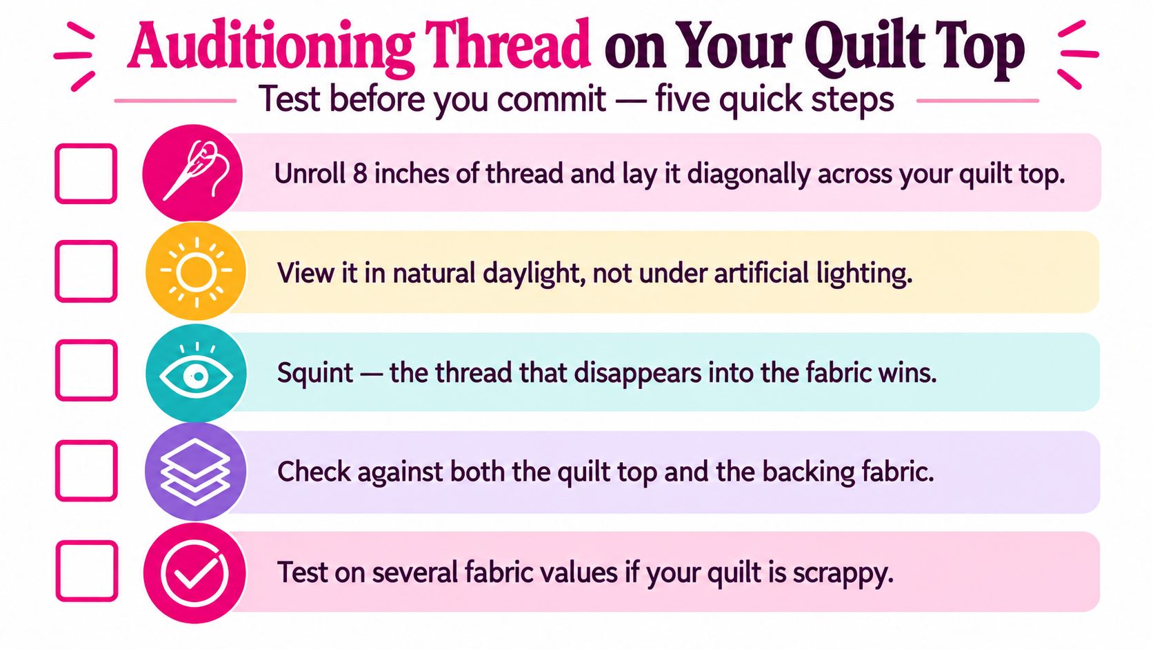
A thread that looks right on the spool can become too bright, too dull, or too shiny once it crosses the quilt. Pull candidates from your neutral thread library and test them on the actual quilt top under the lighting used for inspection and quilting. This value-first approach is more reliable than chasing an exact hue that may only match one fabric.
A loose strand shows how the thread catches light, crosses print motifs, and shifts against neighboring fabrics. The process described in this thread auditioning reference is useful, but the quilt itself remains the final judge.
The audition method
Drape 3–4 yards of thread across the quilt. A longer line reveals changes in visibility and sheen more accurately than a small strand or spool. APQS recommends this real-light test for evaluating thread visibility, so check the quilt in natural daylight and near the machine.
Move the thread through five working areas:
- Lightest lights: Check whether it becomes a hard, distracting line.
- Darkest darks: Look for a pale strand that creates an unintended outline.
- Midtones: See whether the thread remains comfortable across the quilt.
- Busy prints: Watch for visual chatter or sections where the thread vanishes completely.
- Solid fabrics: Inspect sheen and visibility closely because the surface offers fewer distractions.
Warm artificial light can make a thread appear more yellow, while cool lighting may push gray toward blue. Squint at the quilt from a normal viewing distance. A strong blending choice usually recedes while leaving the quilting texture visible.
Test the actual setup
Stitch a sample with the intended needle, bobbin thread, batting, backing, and quilting pattern. Examine both sides for balanced tension, clean loops, and consistent needle penetration. A thread that looks quiet on the top may show clearly on the backing or behave differently after tensioning.
The quilting design also changes the result. Dense pantograph stitching can make a heavier-looking thread read louder than an open edge-to-edge design. For ruler work with the Mini Curvit Ruler for Longarm Quilting, inspect curves and straight sections separately. Overlapping stitches and tight turns often make an otherwise subtle line more noticeable.
Thread Weight and Sheen Effects
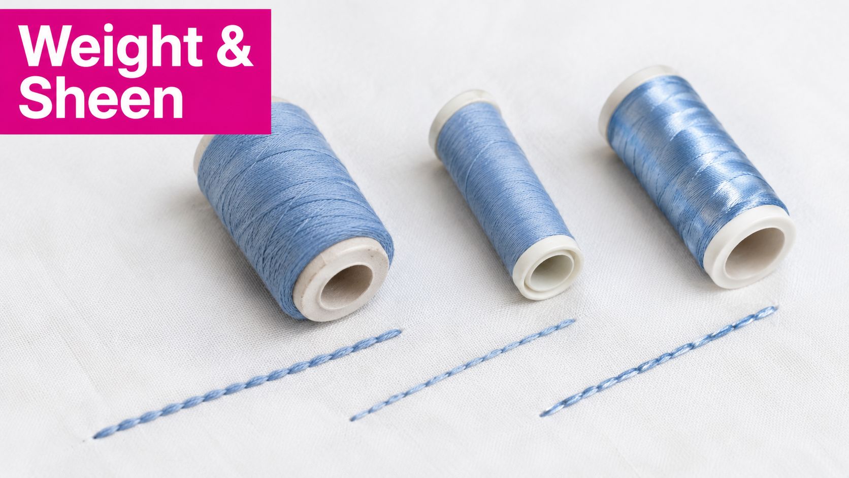
A thread can match the fabric beautifully and still produce the wrong quilting effect. Choose by color and value first, then adjust weight and sheen for the pattern, fabric surface, and machine setup. For versatile piecing and quilting, a 40–50 weight thread is a common professional starting range because a thinner thread often blends more easily when the hue is not an exact match. This quilting business guidance discusses the 40–50 weight range.
A 50-weight thread generally creates a quieter line, which can suit dense quilting or a top containing many fabric values. A 40-weight thread gives the stitches more presence while remaining useful for general work. The choice depends on the quilting pattern, batting loft, fabric weave, needle, and the texture you want to show.
Weight also changes how the thread behaves on the machine. A thread that is too heavy for the needle can cause poor stitch formation, drag, or unstable tension. Very fine thread may run smoothly but leave an open quilting design with less definition than expected. Production quilters usually keep several weights available and choose based on the finished texture, not the spool label.
Sheen can override a good color match
A shiny thread catches light and can look more prominent than a matte thread with a similar value. The difference is easy to see on modern solids, where there are few printed shapes to interrupt reflected light. This instructional video on thread choice addresses color, weight, and sheen as separate decisions.
Use this order:
- Color and value: Decide whether the thread should blend or contrast.
- Weight: Set the level of stitch definition the pattern requires.
- Sheen: Compare matte and lustrous options under the lighting used to view the quilt.
A color-matched shiny polyester may trace every curve, while matte cotton in the same value can make the quilting look softer. That trade-off matters on dense designs, solid fabrics, and quilts intended for display.
Stitch a short sample before loading the quilt. Check the top, backing, bobbin thread, tension, and overall texture. A controlled sheen and clean stitch matter more than an exact spool match.
Thread Selection Across Quilting Styles
The best thread color depends on what the quilting is supposed to accomplish. A longarm studio handling varied customer quilts benefits from a compact neutral system because it reduces cone changes and makes selection faster. The same neutral may be ideal for a traditional quilt but too quiet for a modern wholecloth design.
Traditional and scrappy quilts
Traditional pieced quilts usually benefit from a thread that settles into the dominant value range. Medium gray, taupe, tan, and ecru can travel across mixed fabrics without competing with block construction. Scrappy quilts need especially careful testing because no single fabric represents the entire top.
Look at the quilt from a distance before focusing on individual blocks. If the top reads as mostly light, begin with light neutrals. If dark sashing or strong outlines dominate, test a deeper neutral as well. The final choice should support the overall value structure, not just the most attractive fabric on the table.
Modern solids and geometric quilting
Modern quilts often tolerate, and sometimes need, more visible thread. A darker thread on a light solid can emphasize crosshatching, grids, arcs, or repeated geometric motifs. A lighter thread on a dark solid can create a quiet engraved effect.
Contrast exposes construction, so square borders, consistent spacing, and stable tension matter. Before committing, stitch a sample with the intended design and inspect the points where lines intersect. If the pattern looks harsh, move one value step closer to the background rather than abandoning contrast completely.
Decorative and specialty work
Decorative free-motion quilting and embroidery treat thread as part of the artwork. Here, a colored thread or noticeable sheen can be intentional, particularly around appliqué or feature motifs. The selection still benefits from value testing, but the goal shifts from disappearance to controlled emphasis.
For every style, keep the machine setup in the conversation. Needle size, thread path, bobbin casing, batting loft, and stitch density affect the final appearance. A thread that works beautifully in a loose edge-to-edge pattern may look crowded in dense custom work.
Building Your Thread Selection Workflow
Use the same sequence every time you face a new quilt top:
- Read the quilt's values. Identify whether the overall composition is light, medium, dark, or mixed.
- Choose the purpose. Decide whether the quilting should blend, contrast, or decorate.
- Pull neutral and color candidates. Start with your core library, then add specialty options only when the design calls for them.
- Drape the thread. Use a long strand across light, dark, midtone, print, and solid areas.
- Narrow the field. Keep 2–3 finalists and test them with the actual batting, backing, needle, bobbin, and stitch pattern.
- Evaluate sheen last. A matte or shiny finish can change visibility even when value is close.
- Record the result. Note the thread weight, needle, tensioning settings, bobbin behavior, and batting loft for future quilts.
Studio habit: Organize cones by value number before color name. During a busy quilting day, finding the correct light, medium, or dark range is faster than searching alphabetically through color labels.
For production work, a measurable color-control process can supplement visual auditioning. This color-matching resource describes comparing swatches from the first, middle, and last yard of a candidate batch, using L*, a*, and b* values, rejecting samples with ΔE greater than 2.3 or b* variance beyond ±1.0. That level of control is useful when dye-lot consistency matters and a small shift could become visible during quilting.
Frequently asked questions
Should quilting thread match the fabric exactly?
Usually, no. Match value first, then consider undertone and hue. An exact hue with the wrong value can stand out more than a neutral thread that matches the fabric's lightness or darkness. This practical color guide explains why value matching helps quilting lines blend.
What thread color is most versatile for quilting?
Medium gray, light gray, tan, taupe, ecru, cream, brown, black, and white form a practical neutral foundation. The right choice depends on the quilt's value range, backing, batting, and whether you want the quilting to recede or show.
What thread weight should I start with?
Start within the 40–50 weight range for versatile piecing and quilting work. Choose the lighter-looking option when you want subtle blending and the heavier-looking option when the design needs more stitch definition, then confirm the choice with a stitched sample.
How do I test thread color on a scrappy quilt?
Drape the thread across the lightest lights, darkest darks, and midtones. Test a long strand in real light, then stitch a sample using the actual quilt sandwich. If the thread works only on one fabric, it isn't the strongest all-over choice.
Does thread sheen affect color choice?
Yes. High sheen can make a thread read louder than a matte thread with a similar value. Compare finish after choosing color and weight, especially on solids and dense stitch patterns.
Linda's Electric Quilters offers fabrics, batting, threads, notions, instructional videos, and live shopping events for quilting and sewing projects. Visit Linda's Electric Quilters to compare neutral thread options and choose the supplies that will finish your next longarm quilt with confidence.